
Panificio Pasticceria Cassin
I was invited to work on re-branding project (logo design and branding) for Panificio Pasticceria Cassin(Cassin Bakery and Pastry), located in Pordenone province of northeast Italy.
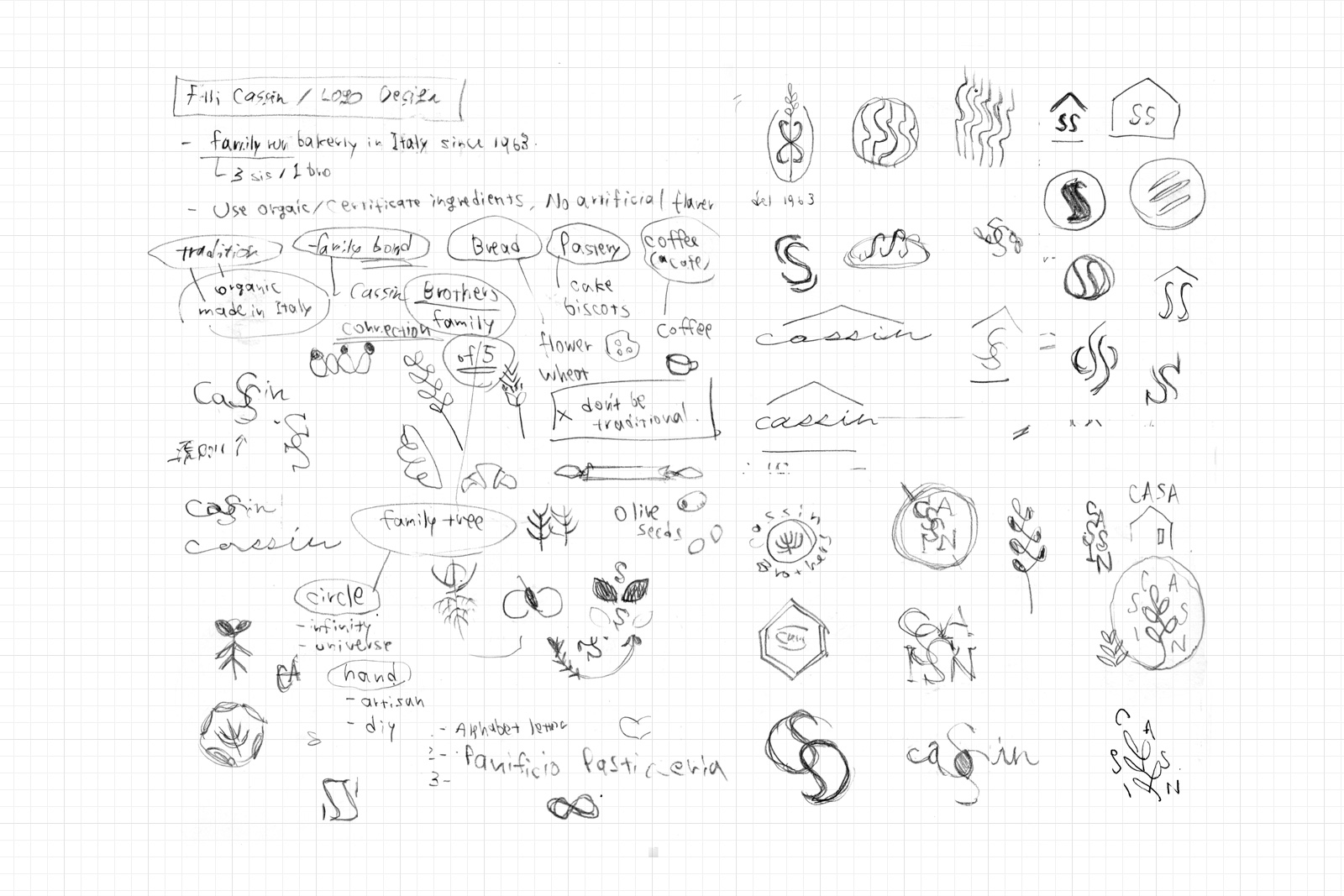
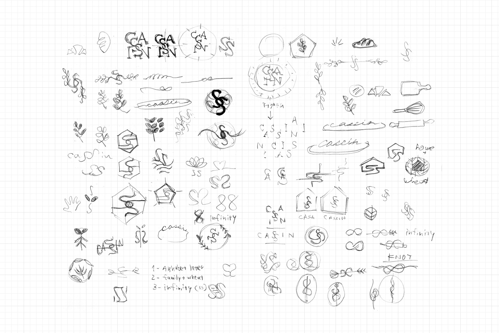
Cassin Bakery is a long-run family bakery business since the 1960s. They are based locally and sustain traditional production methods which have been passed by family members and work closely with local farmers to ensure delivering high-quality bread and pastry made with locally grown organic ingredients.
The foundation of the business is the respect for family tradition and the dedication to maintaining quality. This simple and straightforward concept leads me to take the logo and branding makeover by applying a minimalistic yet friendly approach that reflects this principle, and that style can be favorable among the customer base.
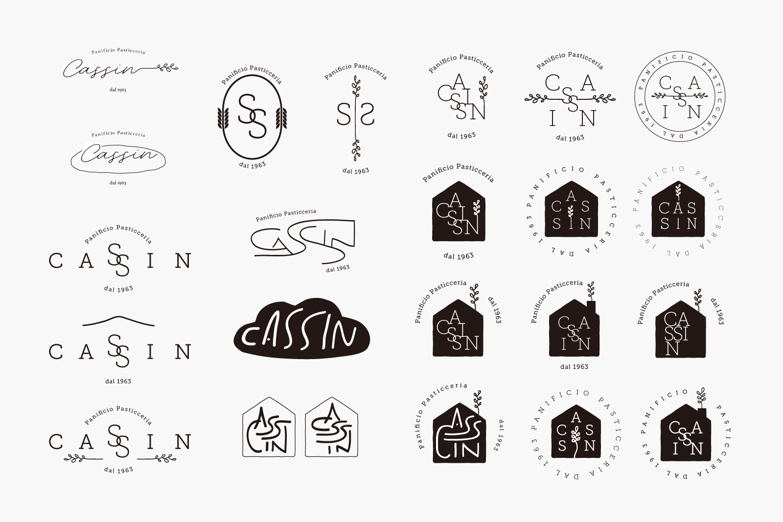
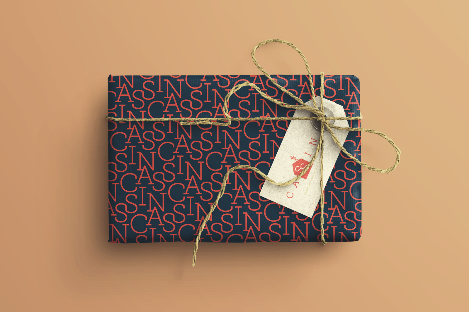
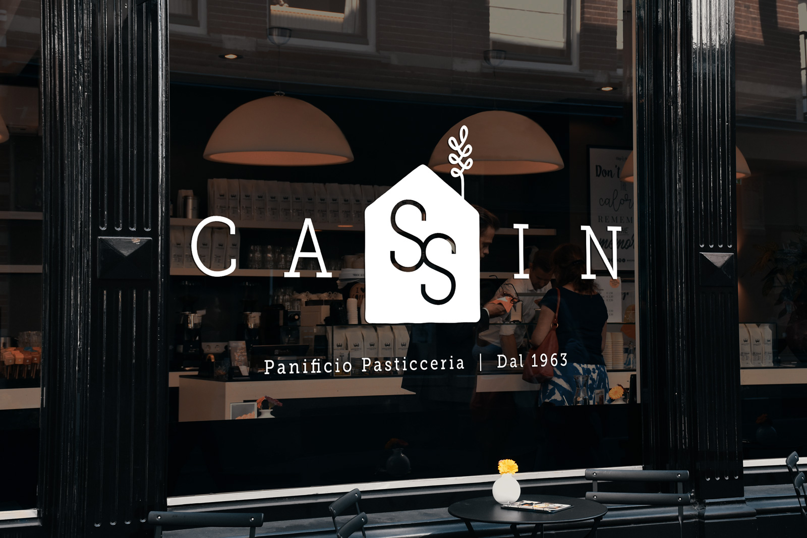
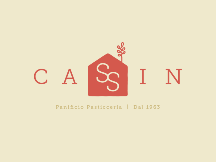
The logo symbol is the combination of a house icon that represents the family business with the joint letters ‘SS’ that represents family bonds, and an icon of wheat on the right top of the roof that indicates a bakery business.
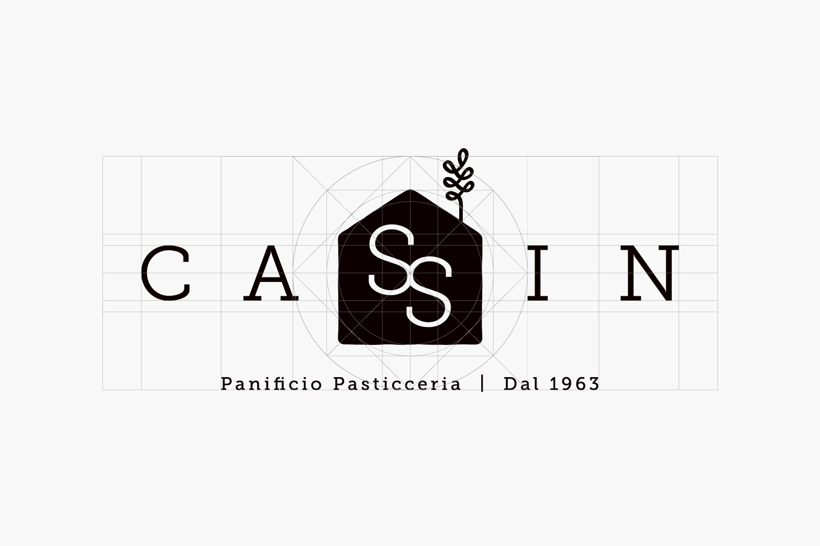
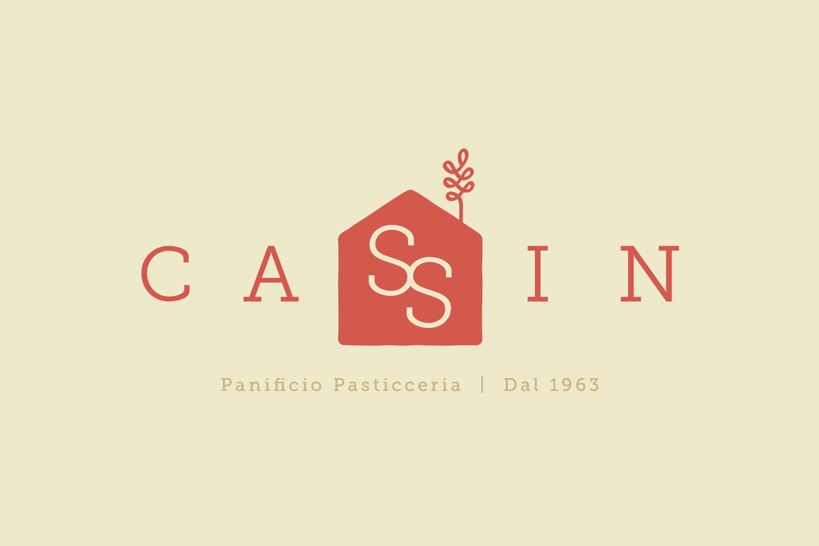
I set the main font as Museo Slub with various weights. Its round shape is remarkable and modern, yet not losing its elegance. The retro and stylish color scheme is created based on the roots of the business back in the 60s. The main warm red colour is extracted from the roof of their original cafe.

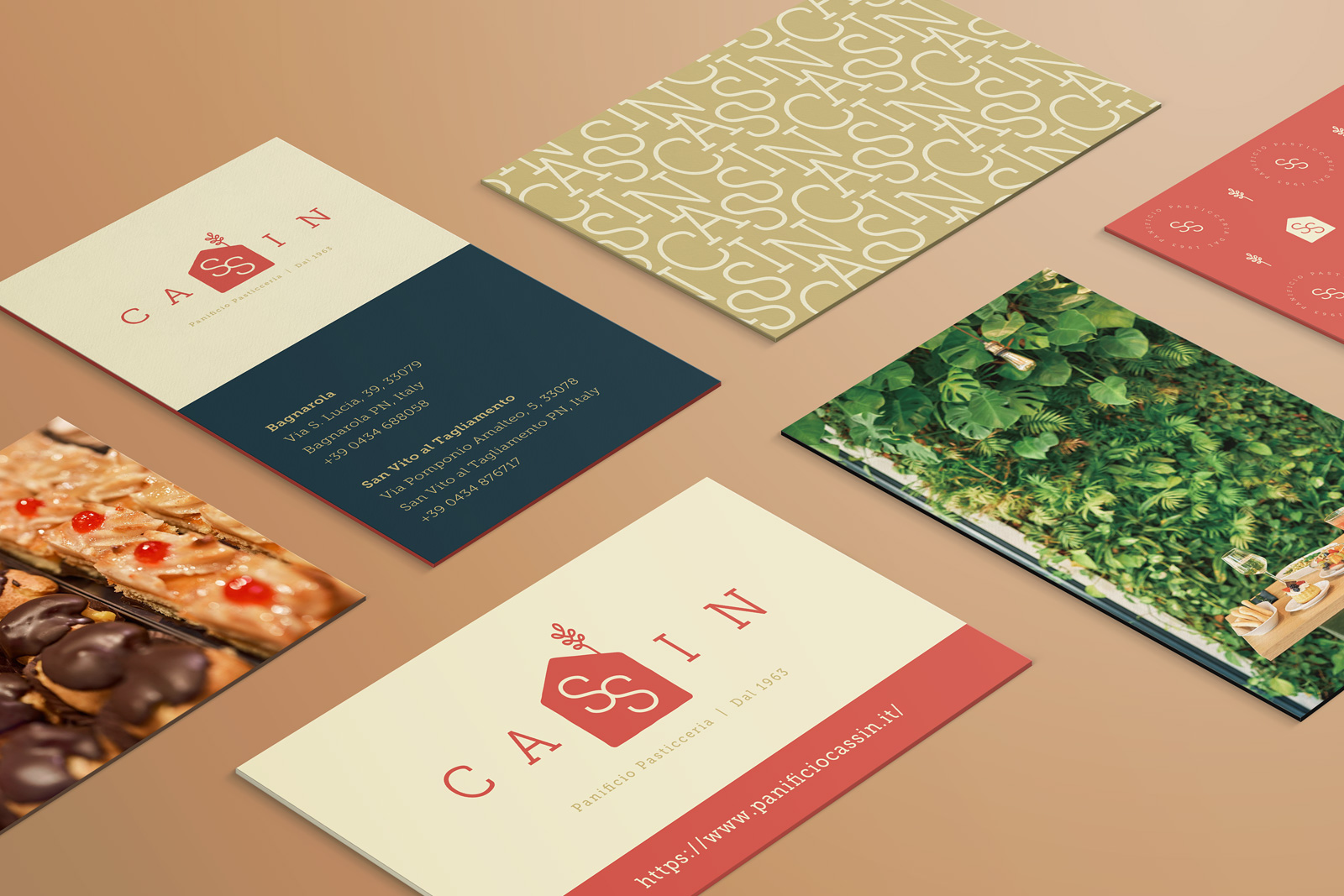
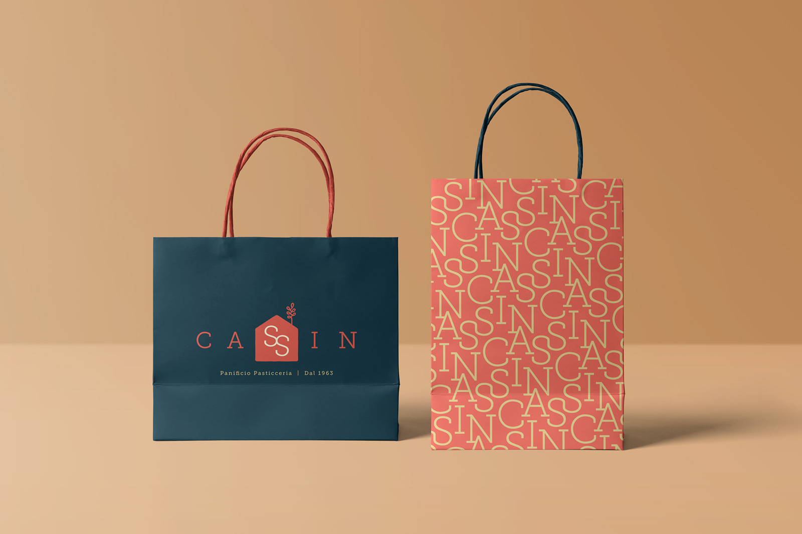
The branding guideline includes additional elements such as pattern designs, icons and lines for website use and emblem-style round stickers, plus website layout suggestions, mockups of merchandise items, and the basic branding rules to follow.
Recent Portfolios
Taiwan Food Festival 2023
Panificio Pasticceria Cassin
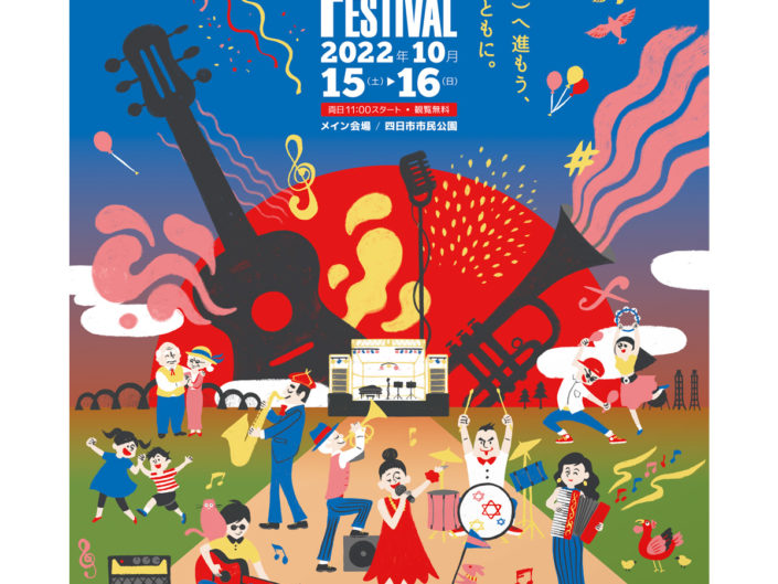
Yokkaichi Jazz Festival in 2022