
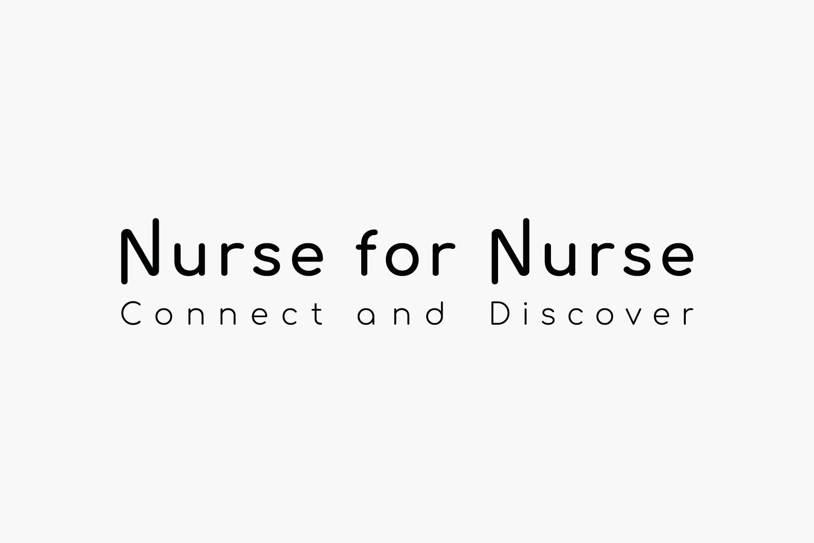
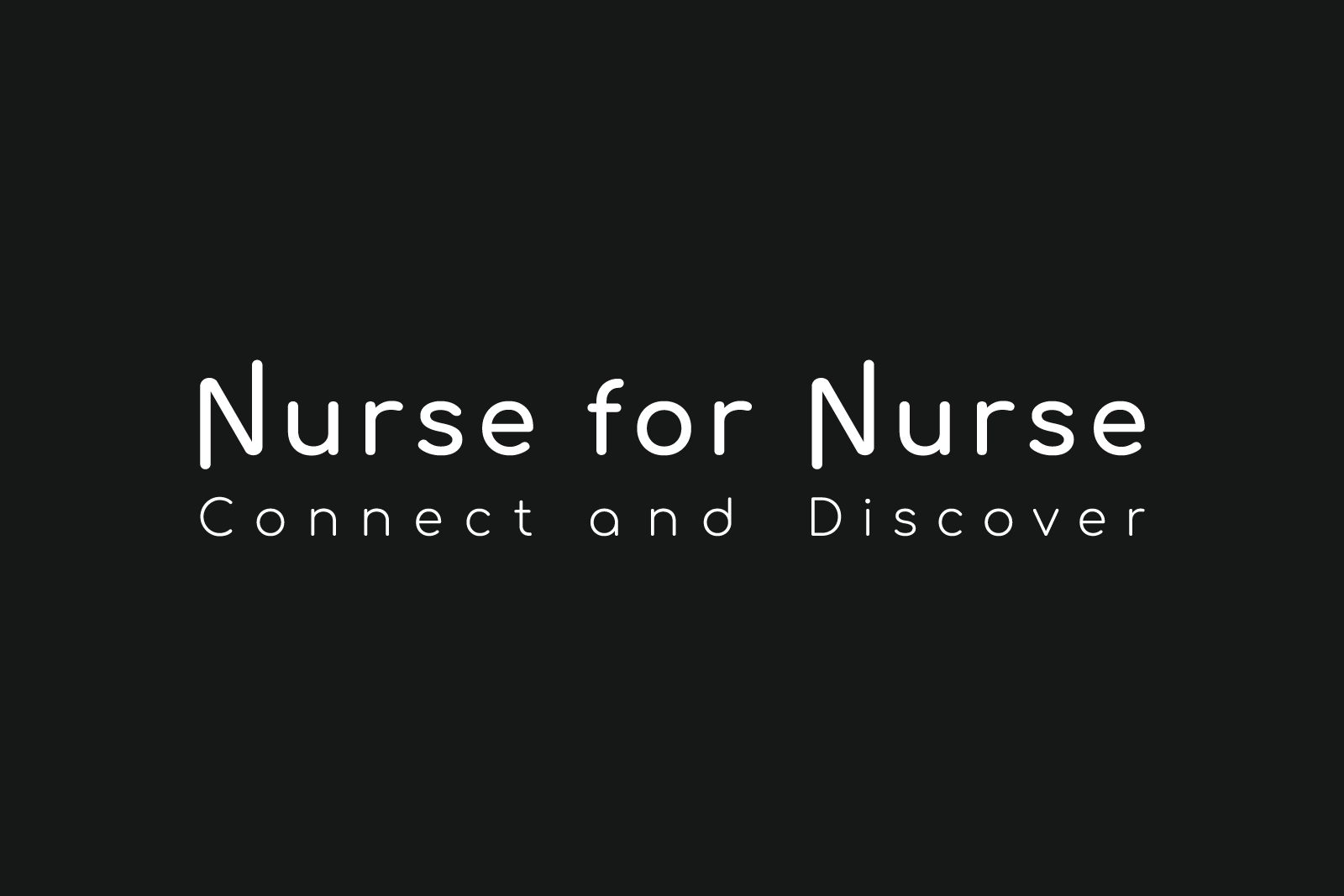
NfN(Nurse for Nurse)
Nurse for Nurse(NfN) is a Japan-based general incorporated association to help nurses connect, exchange information, and support each other in their career development. They observe the changing needs of societies, the needs and challenges of nurses, and create opportunities to discover new areas as well as themselves.
I was given an opportunity by one of the founders who then happened to live in the same city as me, to create a logo for the association.
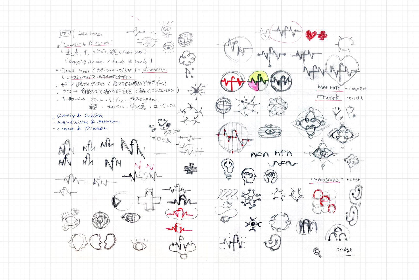
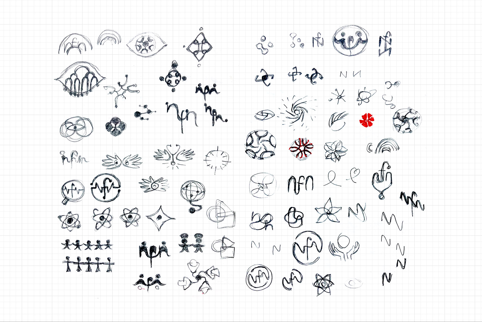
The initial brief was to visualise the concept ‘Connecting nurses around the world’ in a simple, minimalistic approach yet professional look, with multiple colours in comforting tones that represents the nursing industry(As sense of security) as well as the diverse possibility(As hopes) in the future of nurses.
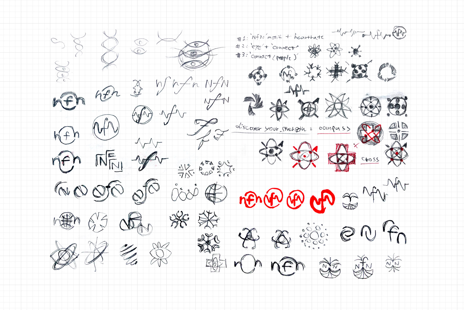
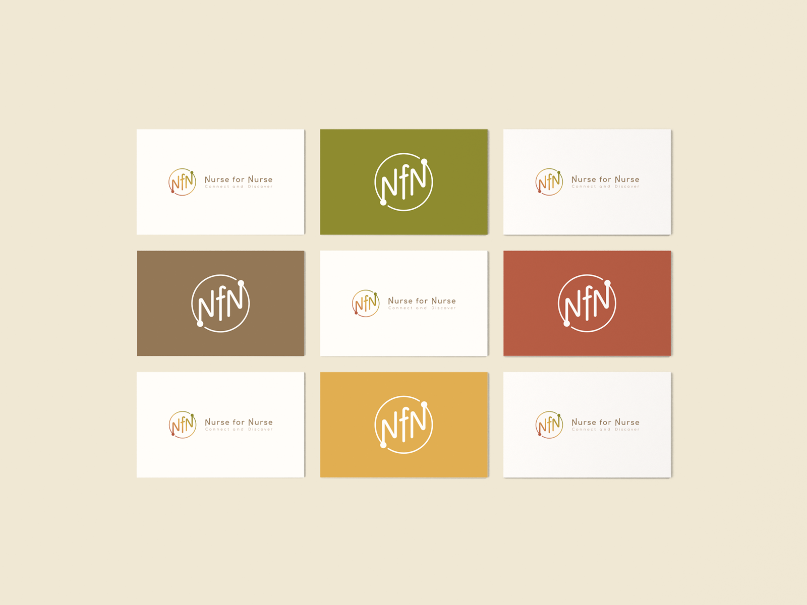
To explore ideas and seek more possibilities that might lay underneath, I created some design drafts using motifs and elements that related to the mission and concept of the association. After some discussion to narrow it down, we settled on one design sketch based on the concept of connecting nurses across the globe(circle) through the dots(nurses) in tip points of the alphabet letters ‘NfN’ and raising up with the whole community toward the right side.
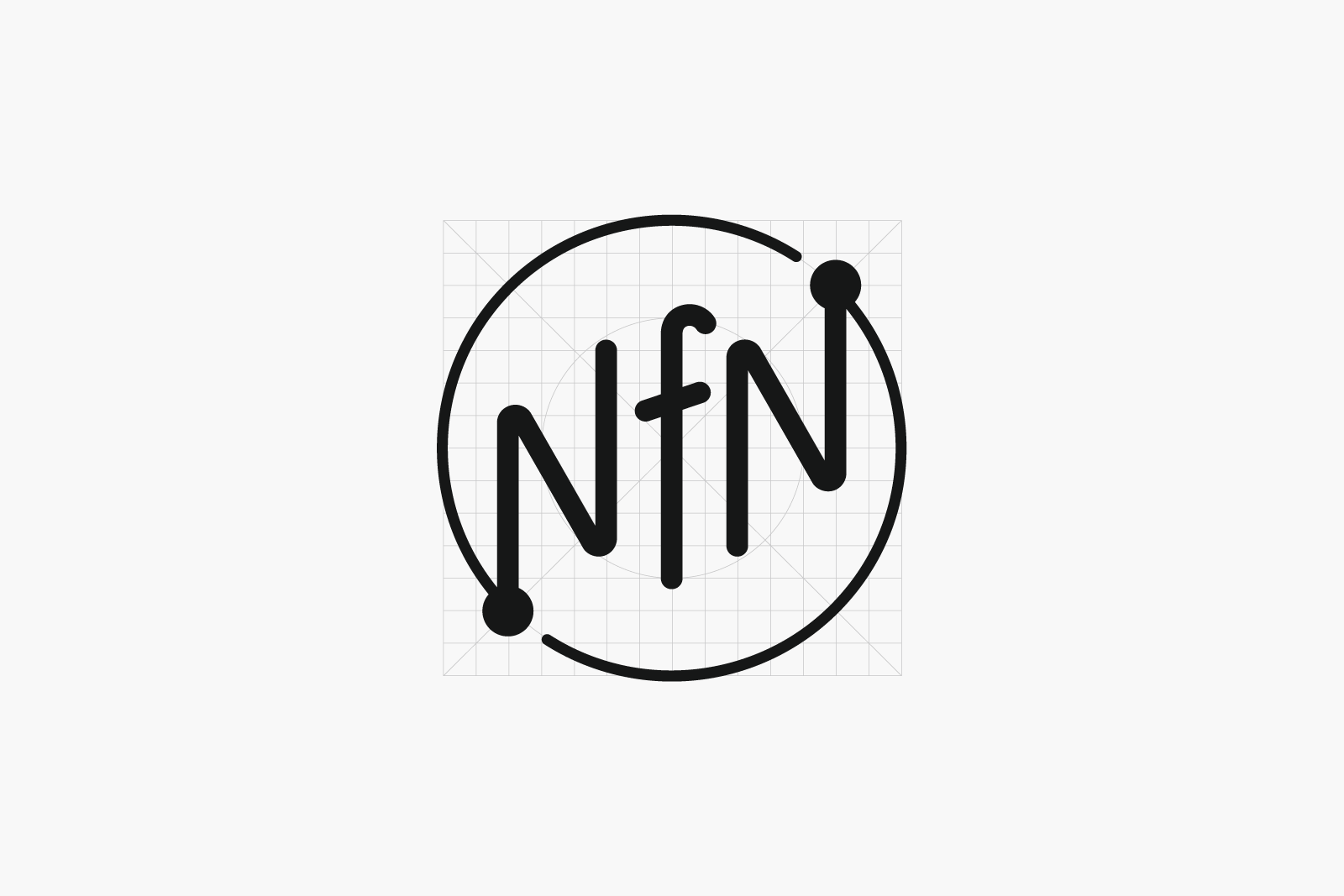
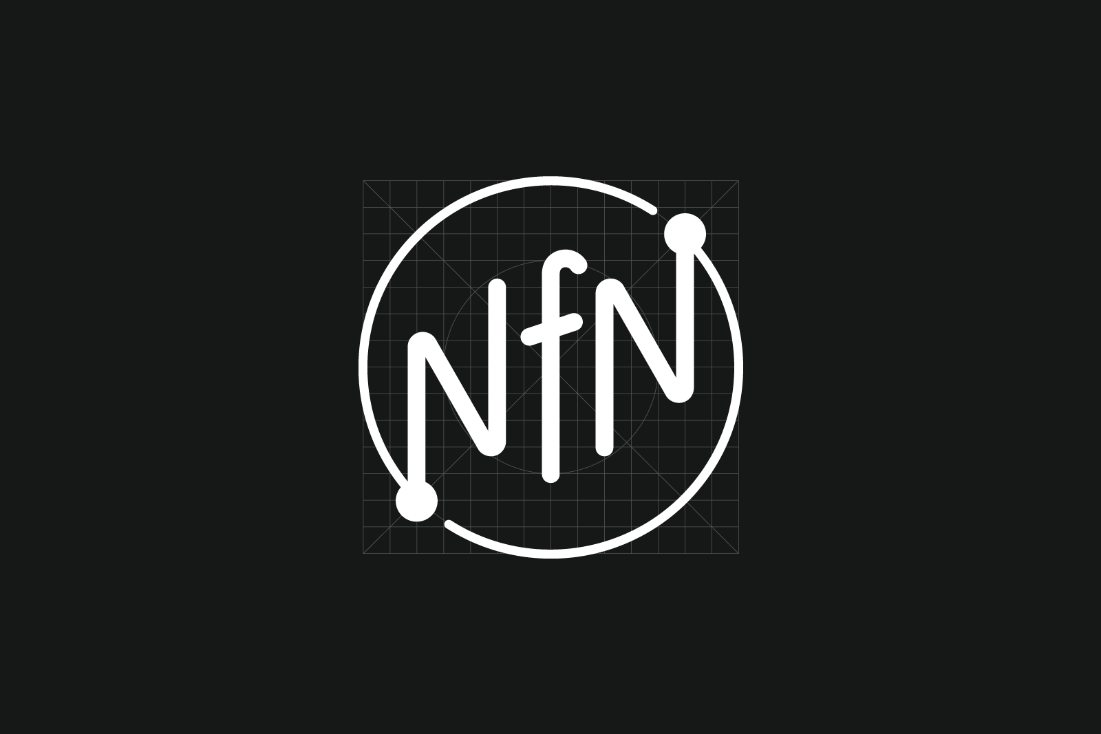
We chose a simple curvy-body font as the logotype with a visual effect of being able to connect with each corner and point of the letters flexibly, in order to represent unity and solidarity.
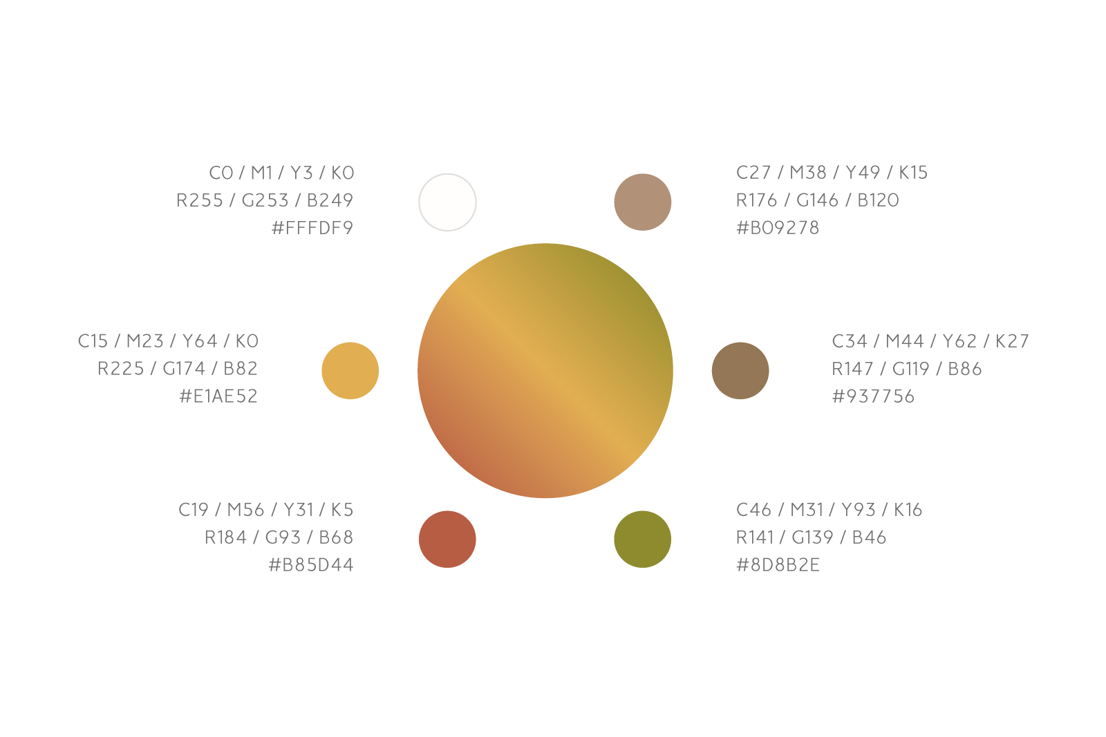
As for the colour, we picked up natural and comforting shades that represent what nurses contribute to our society – hopes and security, but also their professionalism, passion and dedication. The colour gradient represents one of the three core values of the association, which is “Diversity, Equity and Inclusion”.
The final design was delivered in minimalist style on warm, earthy tone colours and gradient, with a wish for all who aspire to become a nurse, currently working as a nurse and who seeks future career oppotunity from a nurse, to be able to engage long-lasting familiarity with. I hope it works as the catalytic symbol of generating diverse future possibilities as well.
Recent Portfolios
Taiwan Food Festival 2023
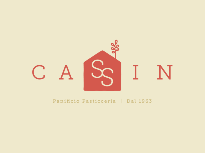
Panificio Pasticceria Cassin
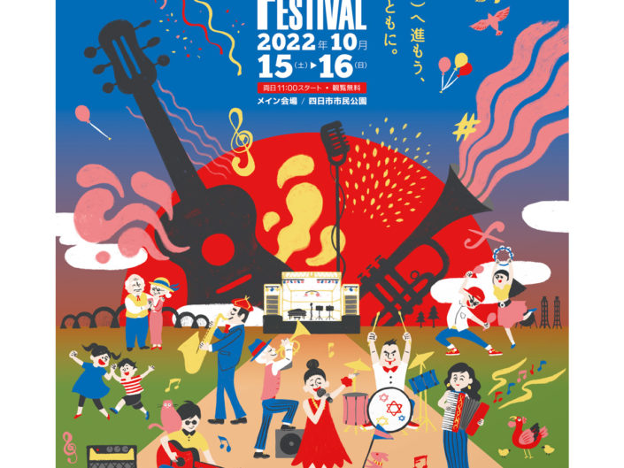
Yokkaichi Jazz Festival in 2022