
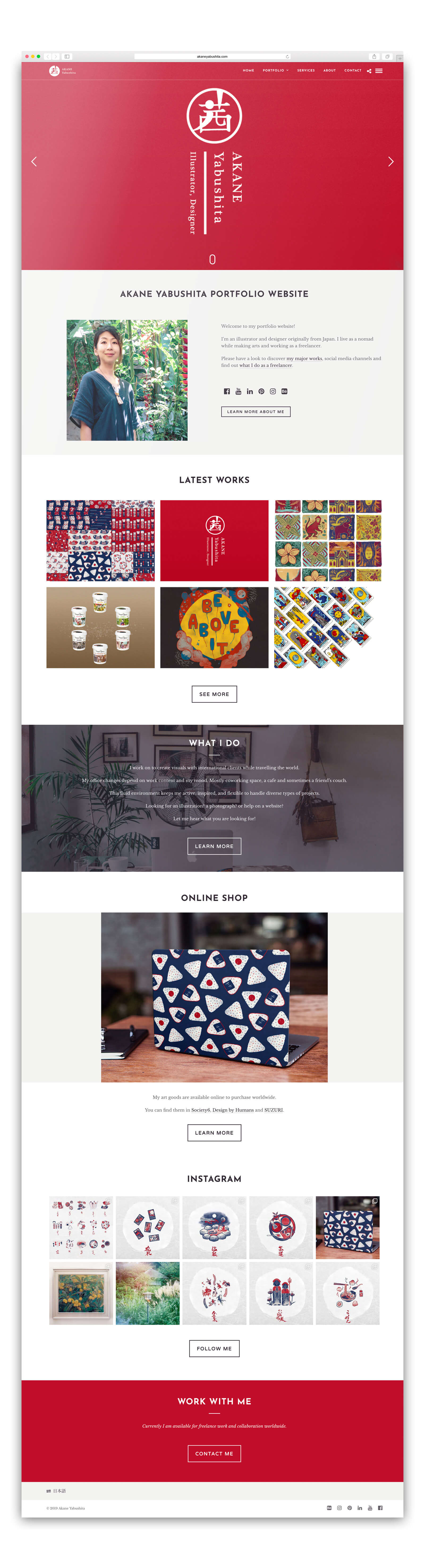
Personal Branding
I worked on my identity and portfolio to strengthen the personal presence and enhance brand authenticity.

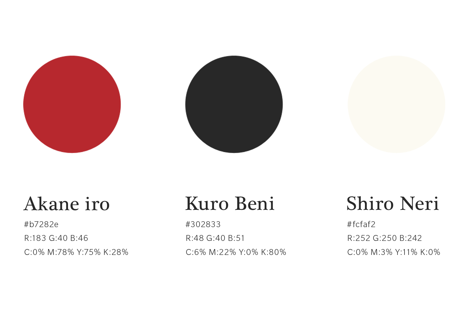
I set a symbolic Japanese Kanji character of my name Akane(茜) which also means a subtle dark-red in Japanese traditional colours, as the main feature of the logo.
I then incorporated with a touch of brush stroke which was written by a Japanese calligraphy brush with Hinomaru(Flag of Japan) as a background. This represents both my Japanese identity and illustration style which is influenced by 80-90s Japanese pop culture.
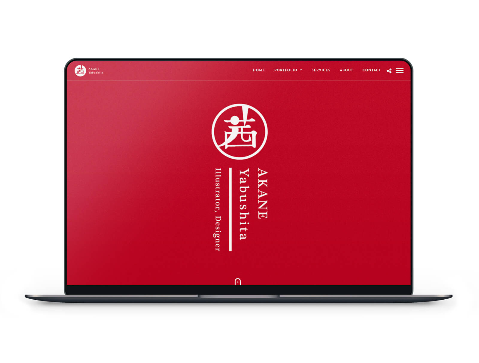
Portfolio website is built in WordPress in dual language(EN/JP). Summarised text and link buttons in each section make visitors ease to browse through the whole contents.
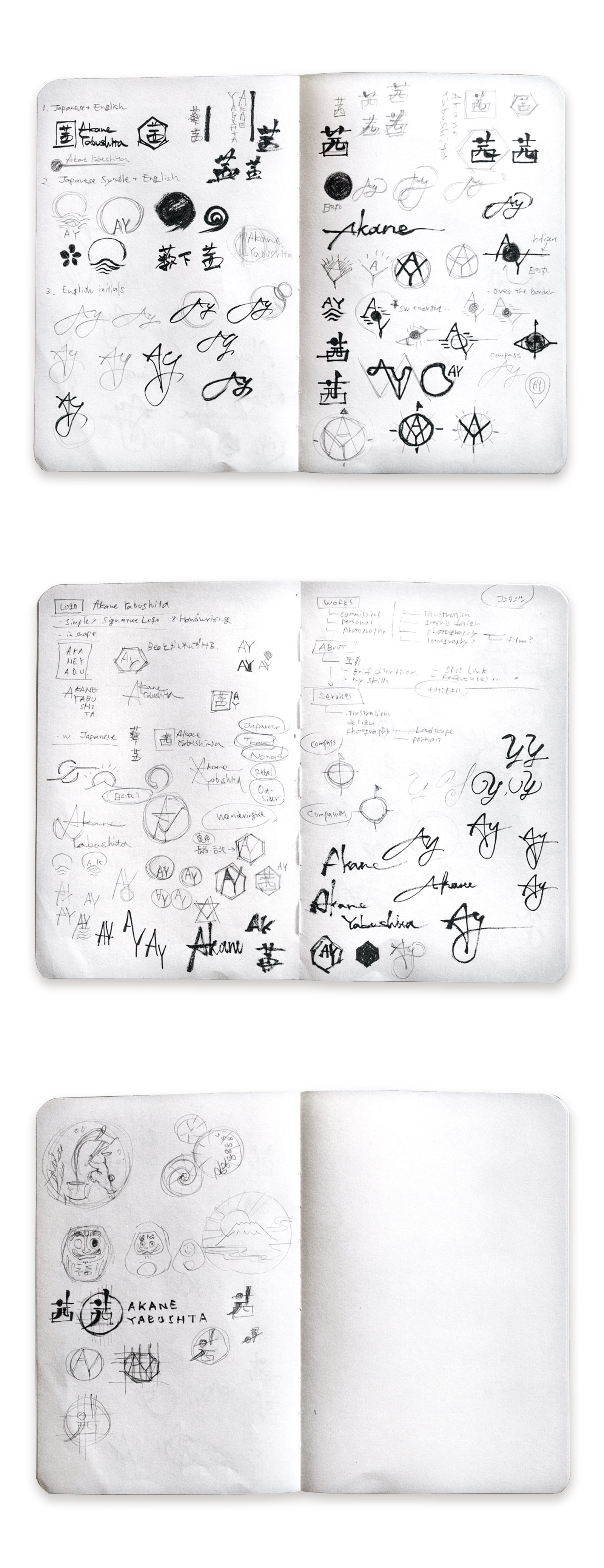
In each project page, I included the project brief, initial sketches and inspirations to show the process to the final piece.
I used many photographs and included links for social media and a personal blog to raise authenticity, as well as to provide information about my ongoing projects online.
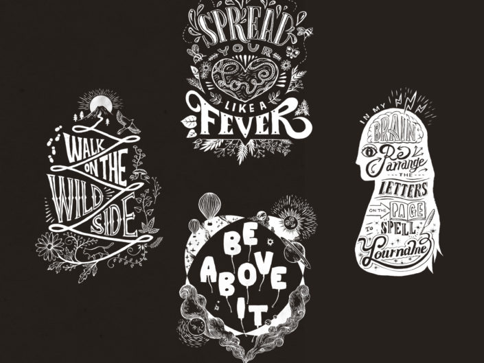
Recent Portfolios
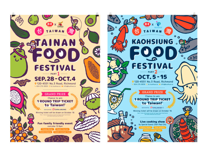
Taiwan Food Festival 2023
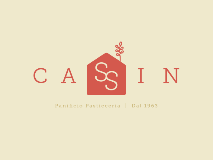
Panificio Pasticceria Cassin
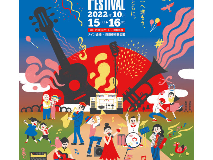
Yokkaichi Jazz Festival in 2022