
Dokoiku Japan
Dokoiku Japan is a new travel website designed for independent travellers who wish to explore off-the-beaten-track in Japan. The website covers comprehensive yet accessible information travelling across regional Japan.
I started working with the client, who himself is an expert travelling regional Japan, from the initial stage of building the brand. I was responsible for brand naming, logo designing, style guideline and itinerary design to be implemented WordPress website.
1. Brand Naming
We wanted a brand name to speak the concept of the website in short and memorable 2 combined words, and avoid using words that commonly used by competitors.
Among a long list of relevant words, the combination of ‘Dokoiku(どこ行く)’ = Where to go? and ‘Japan(日本)’ struck us the most. The casual Japanese word ‘Dokoiku’ conveys friendliness, and to pair it with ‘Japan’ indicates numerous secret places we can explore in the country. In addition, it’s catchy and memorable enough for foreigners. And ‘Dokoiku Japan’ has officially born.
2. Logo Design
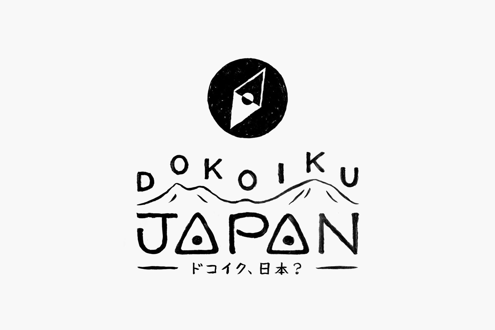
Logo design is fundamentally followed simplicity that represents modern Japanese design, with a playful and vibrant touch that make the logo more open and accessible for international audiences.
We brainstormed ideas in drafts using many relevant motifs such as Mount Fuji, rising sun and local train lines, in order to seek the most effective yet simple approach to fulfil our objective.
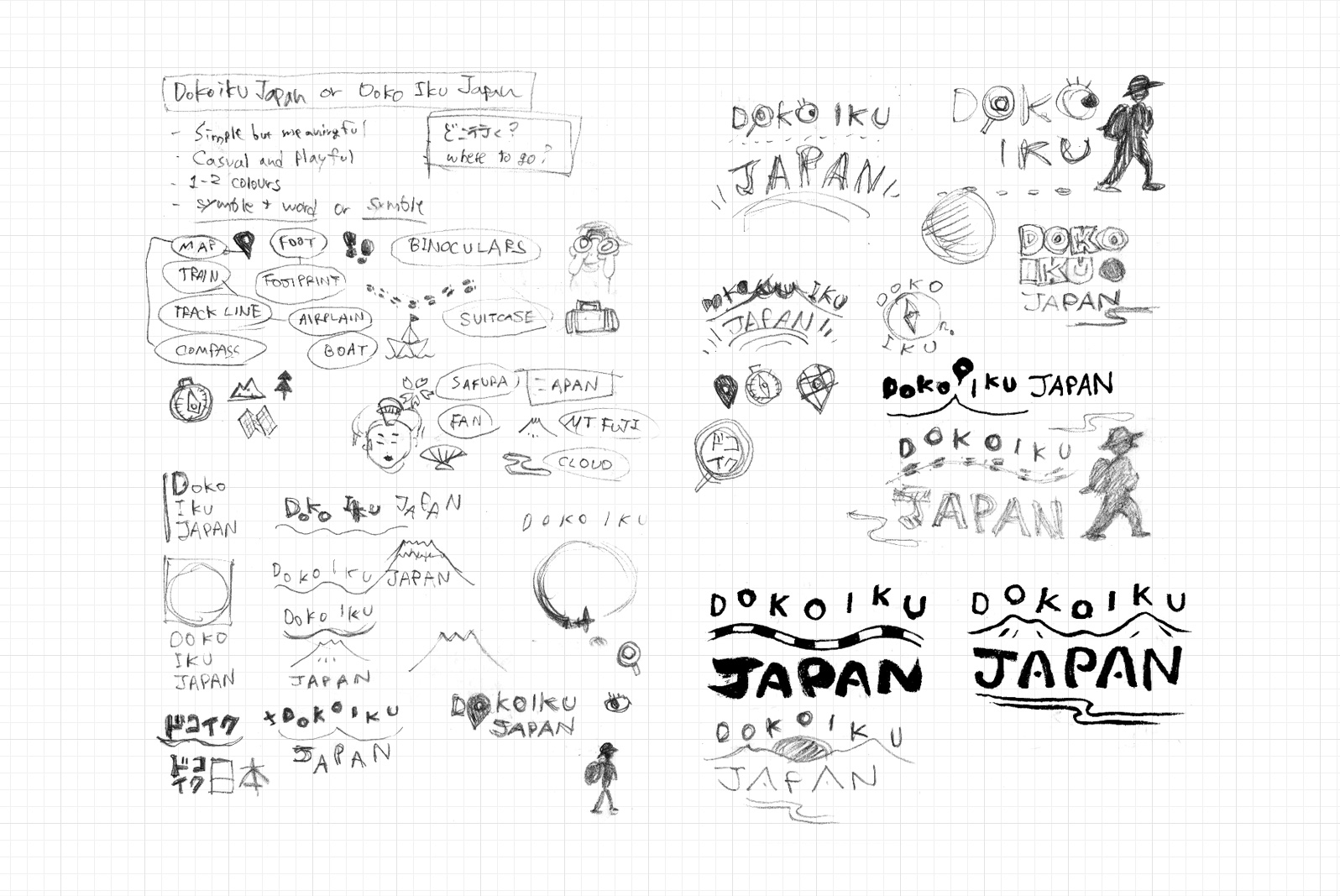
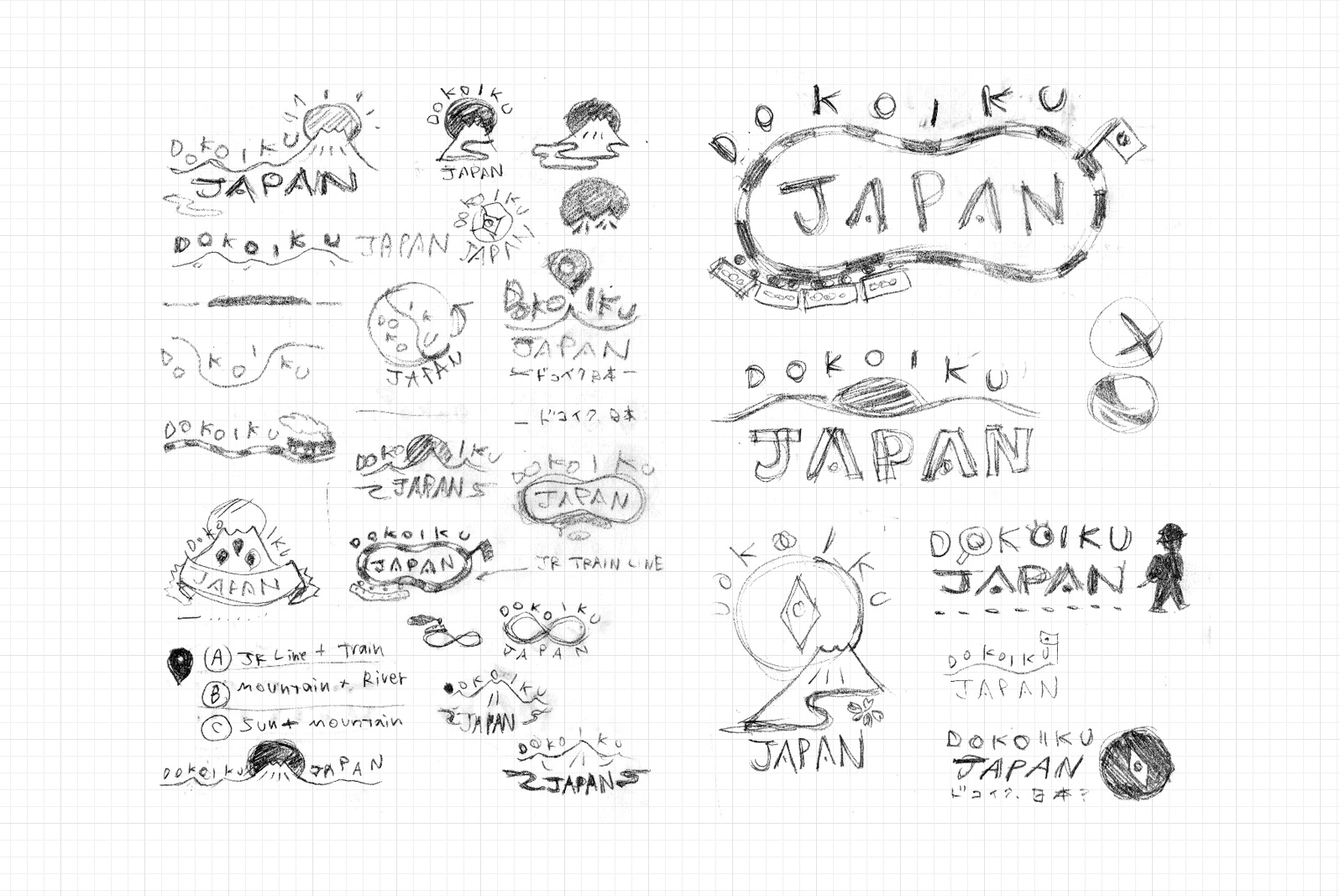
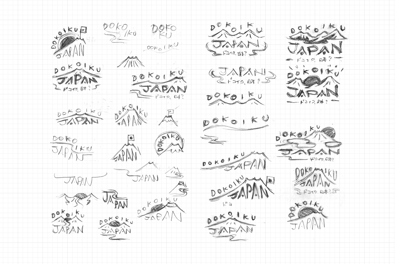
After some experiments, we liked the design of hand-drawn type ‘Dokoiku’ popping up like musical notes on top of the mountain range that represents The Japanese Central Alps, combined with the type ‘Japan’ in which two A’s resembles triangle-shaped Japanese rice balls, tied with a short line of brand’s Japanese name ‘ドコイク、日本?’ to emphasis the authenticity of Japan-related business as well as the accuracy of travel information.
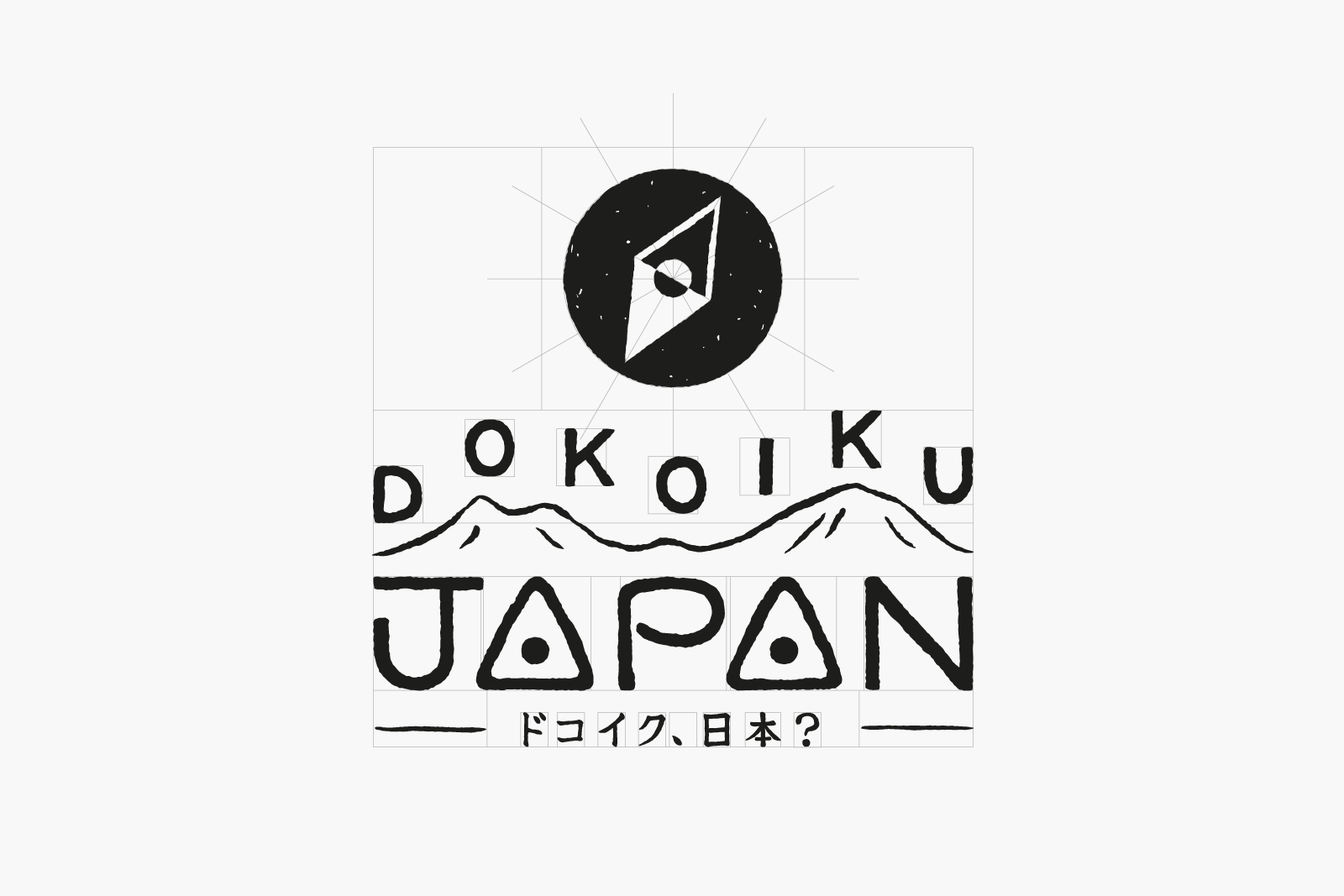
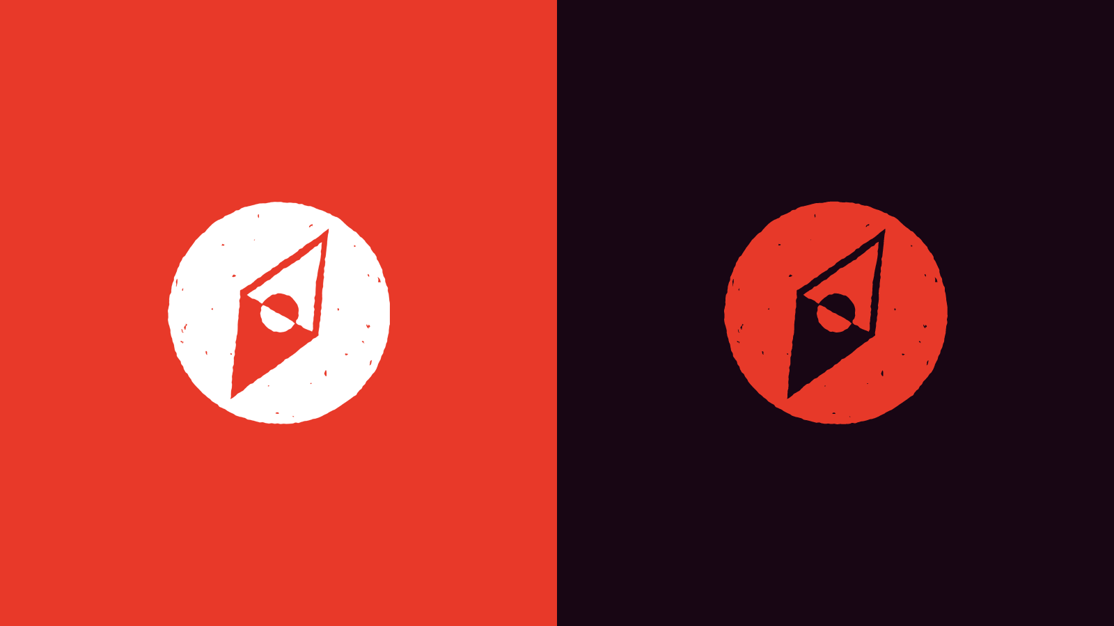
The logotype comes with an icon that represents the Rising Sun(Japan) and a compass(explore) for browser favicon and app icon.
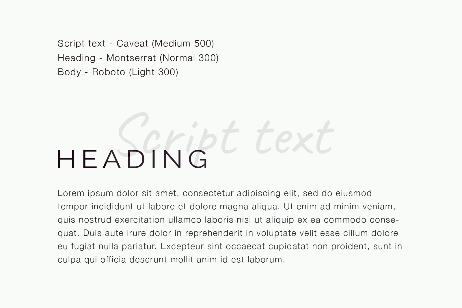
3. Style guideline and Blog Itinerary Design
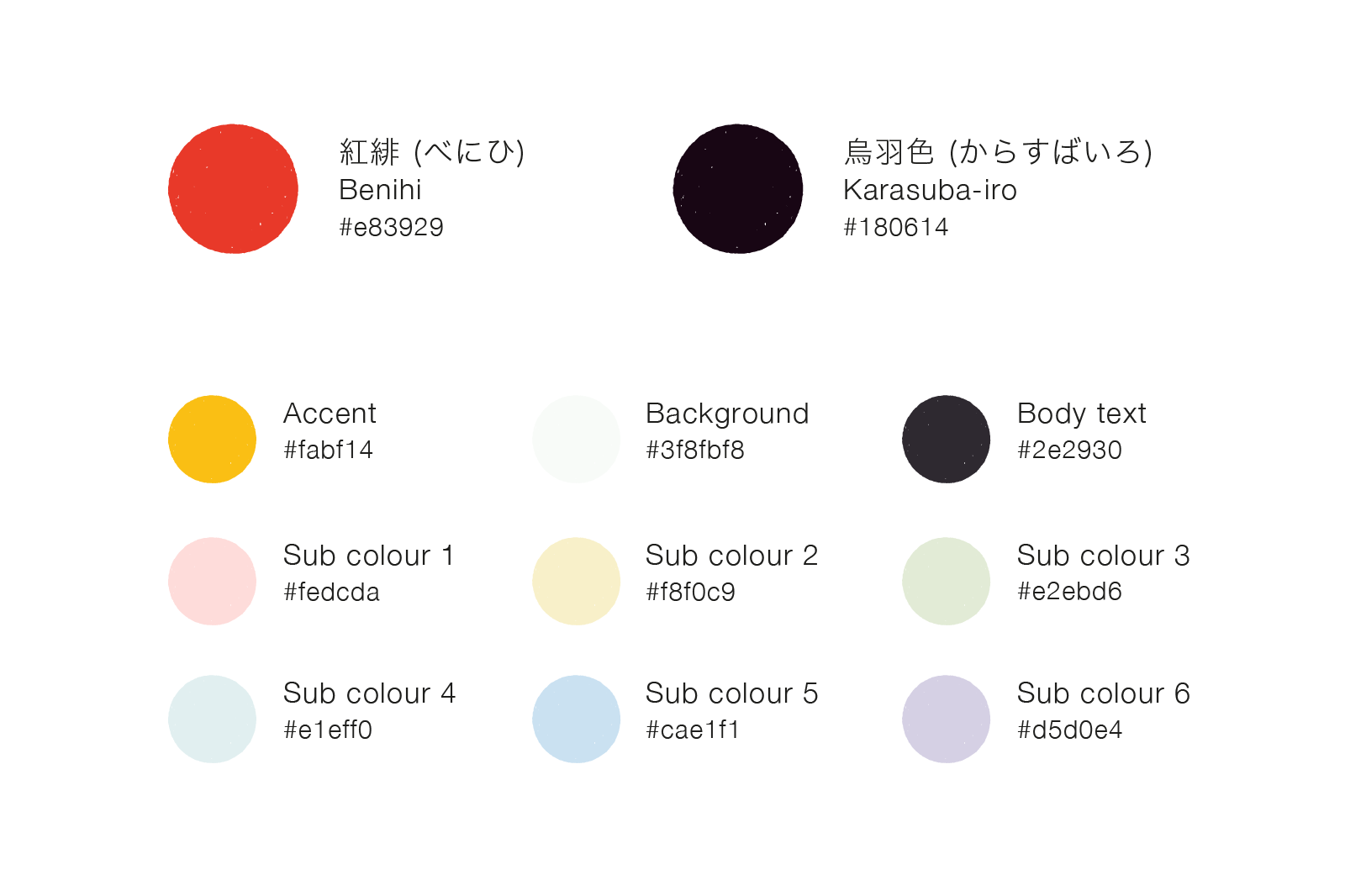
We set the brand key colour as vermilion, the most prominent colour in Japanese culture. We also set a couple of sub-dominant colours along with it for the website use.
We choose website font as serif-based in which high legibility encourage to read long articles as well as to prove the authority.
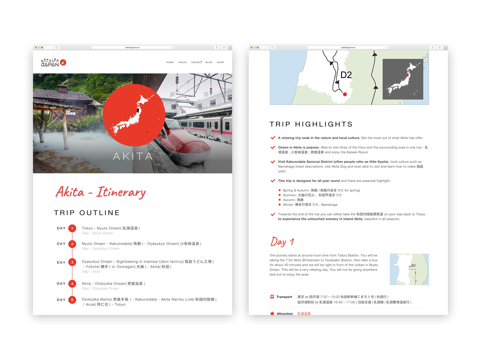
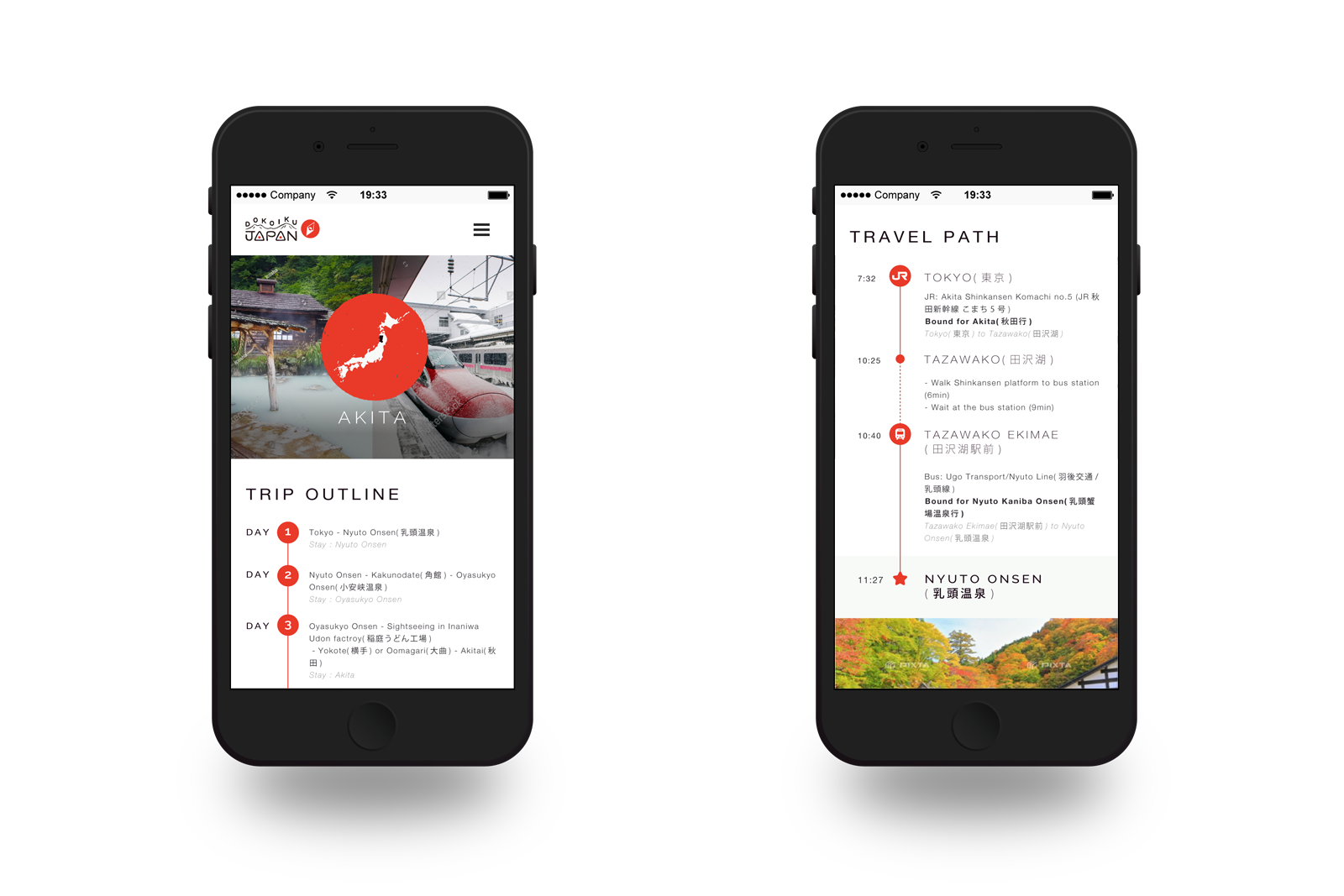
Website Itinerary design focused on articulately translating meticulous travel information in the minimum volume of elements to be implemented in WordPress by only cords, and update by client’s end.
Recent Portfolios
Taiwan Food Festival 2023
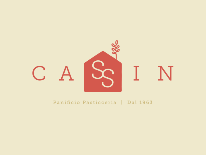
Panificio Pasticceria Cassin
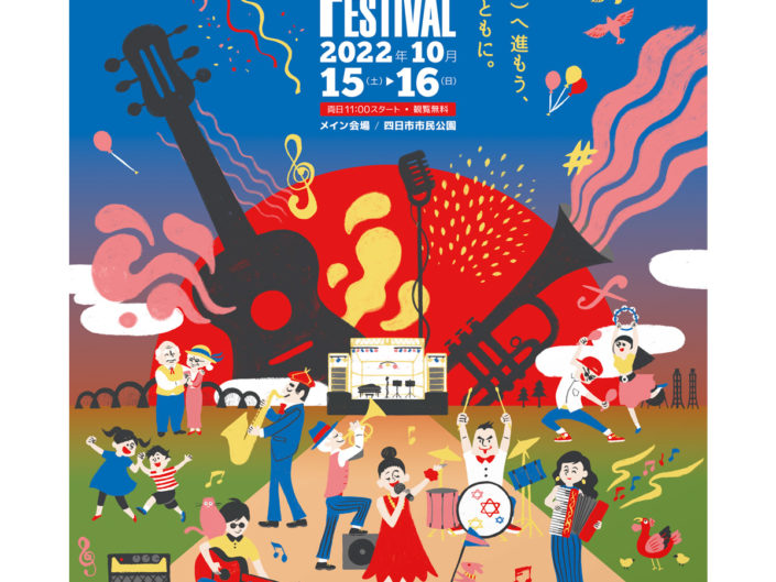
Yokkaichi Jazz Festival in 2022