

Ondalis
Ondalis is an Italian organic cosmetic brand established in 2020. Ondalis comitted to produce high-quality products using 100% organic ingredients only, with the packaging that made entirely from recycled or recyclable materials. These environmentally friendly products are sold in small, travel-friendly containers, reflecting the brand’s 3 core values of sustainability, portability and functionality.
For this project, I was commissioned to redesign the existing product packaging and create identities for each of the 7 product lines.
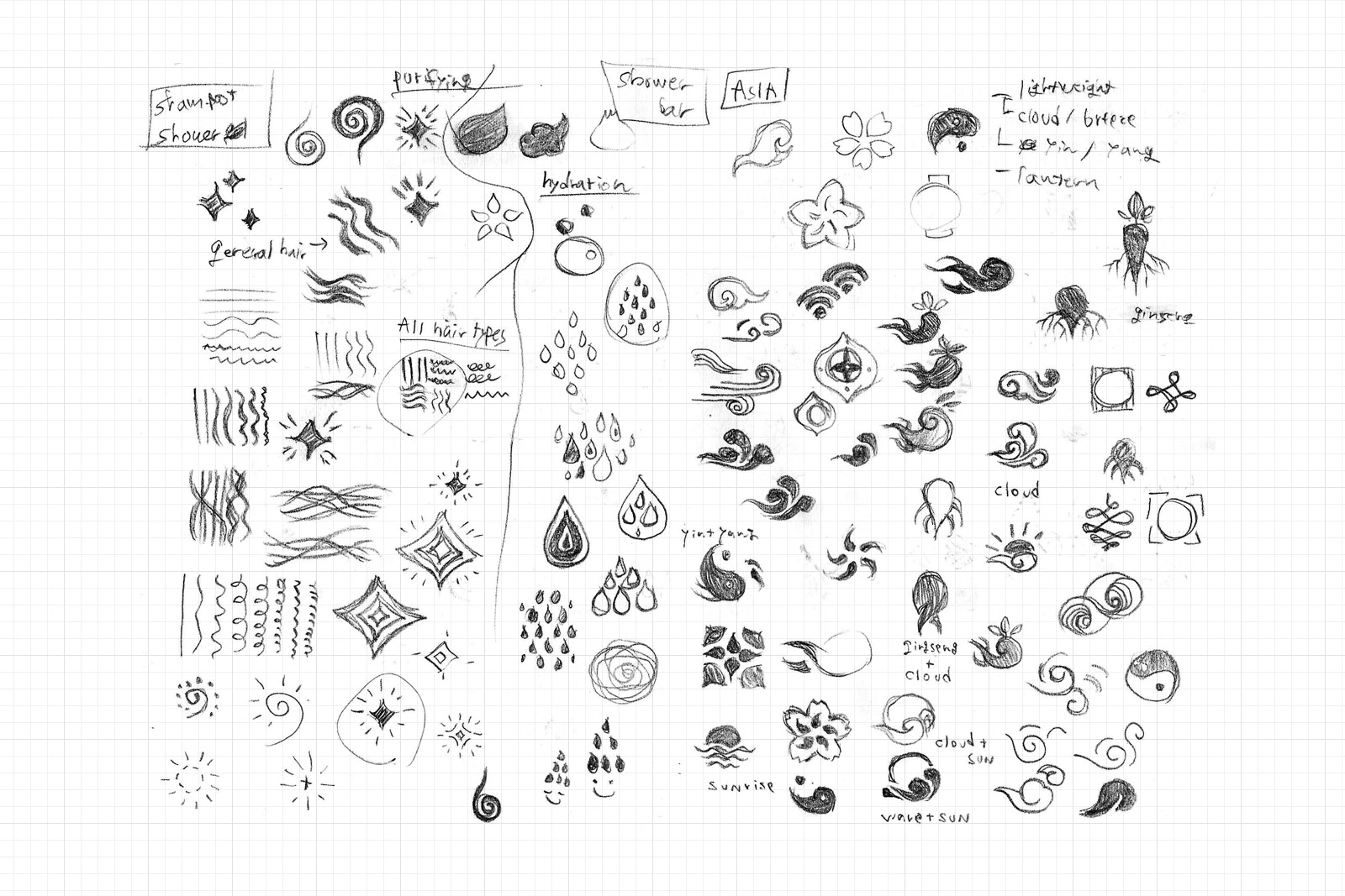 Pencil Sketch 1/3
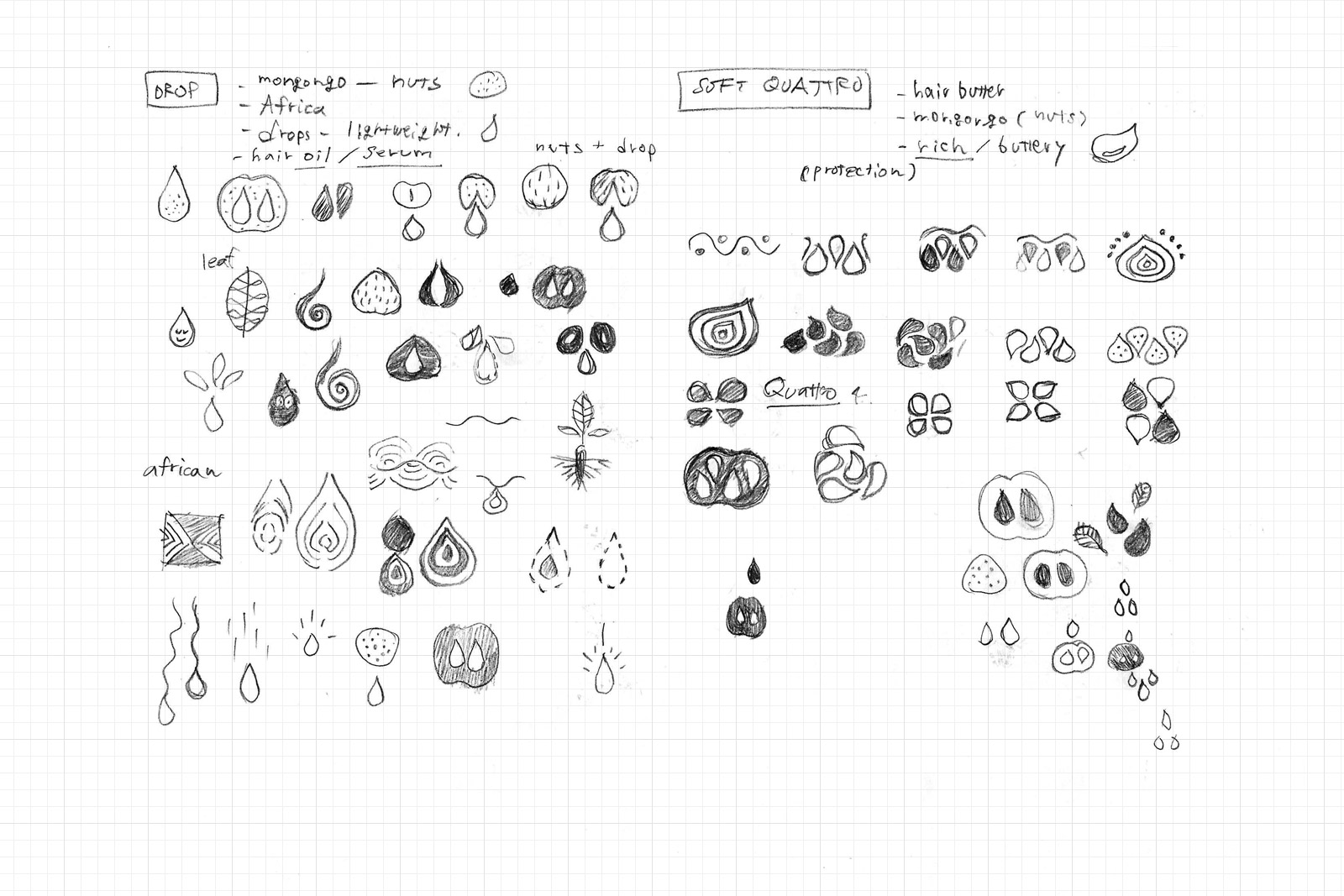 Pencil Sketch 2/3
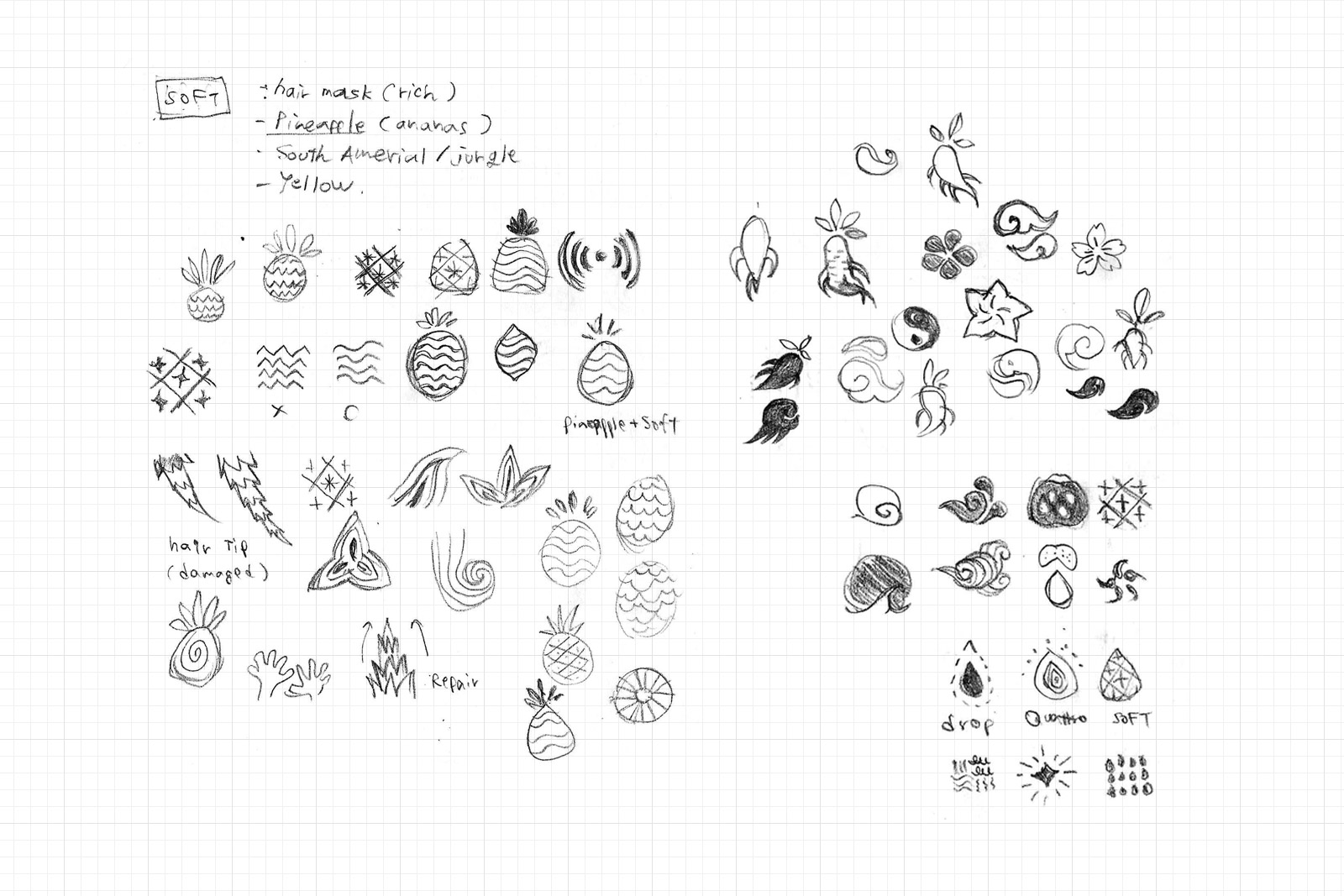 Pencil Sketch 3/3
First, I reviewed and evaluated the branding analysis that initially adopted by the brand, identifying gaps and errors between these analyses and the brand’s core values. Next, I brainstormed methods to fill these gaps and strategies to more effectively and efficiently appeal to potential customers with the products.
As a result of the analysis, we decided to take an entirely new direction by accurately visualising the brand’s foundation “sustainability,” using the philosophy of minimalism. This involved condensing the essence and value of the products into the bare minimum elements to maximise the potential effects.
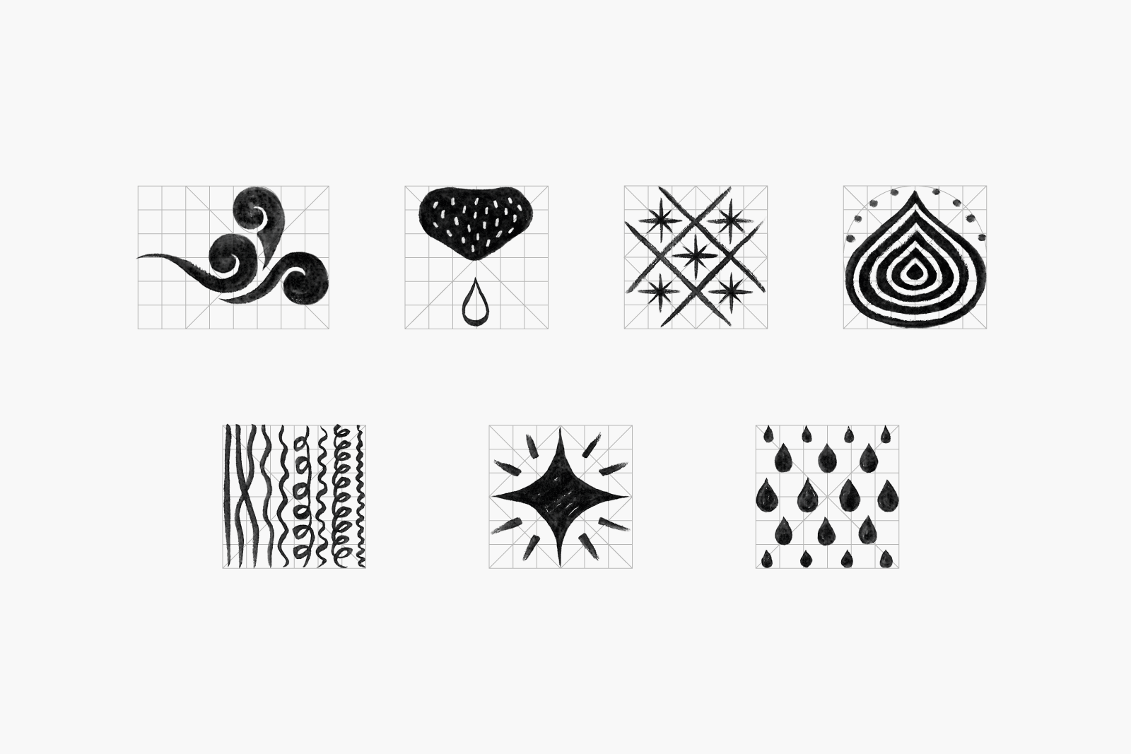
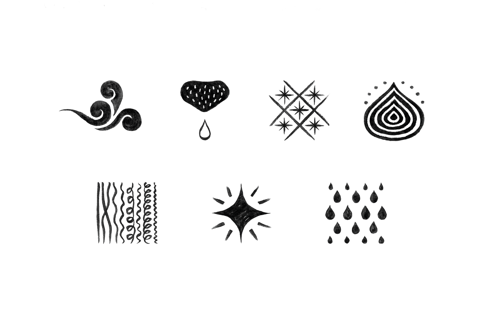
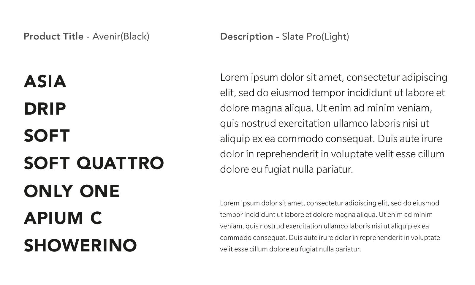
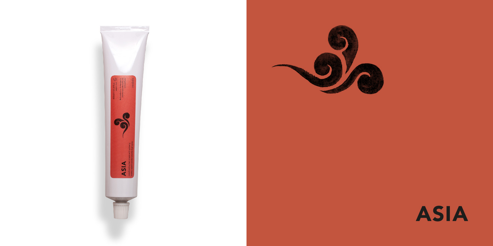
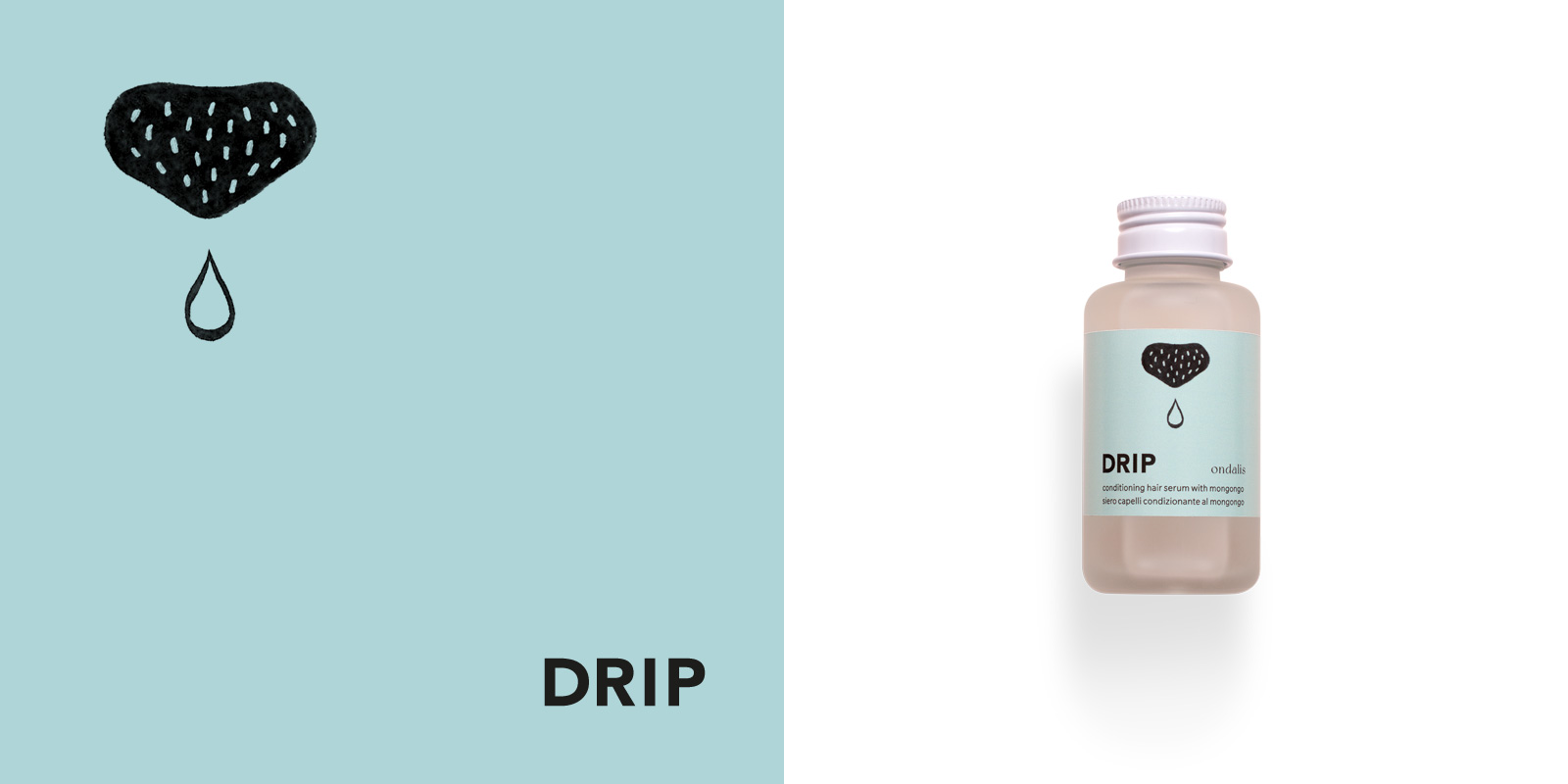
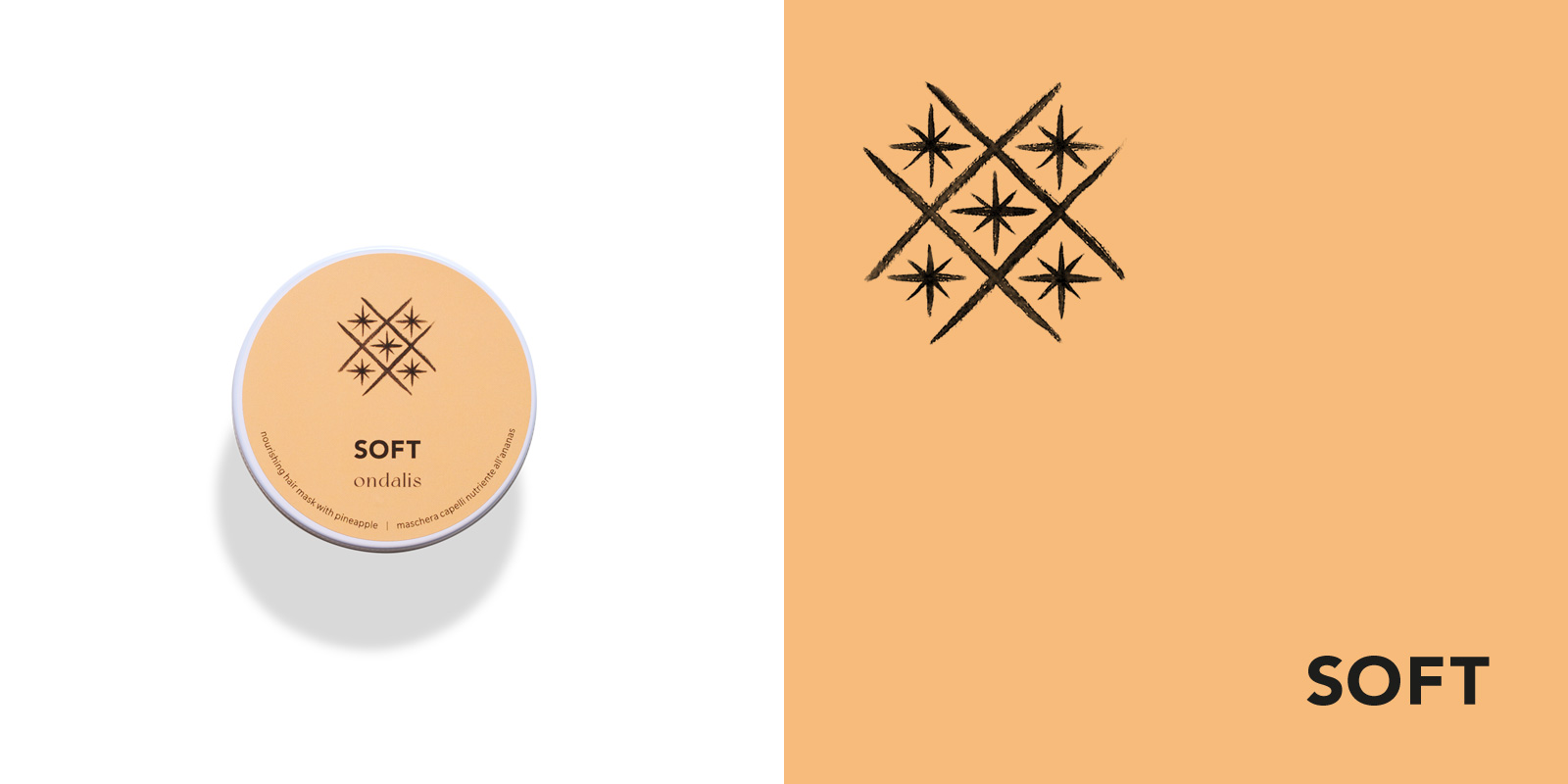
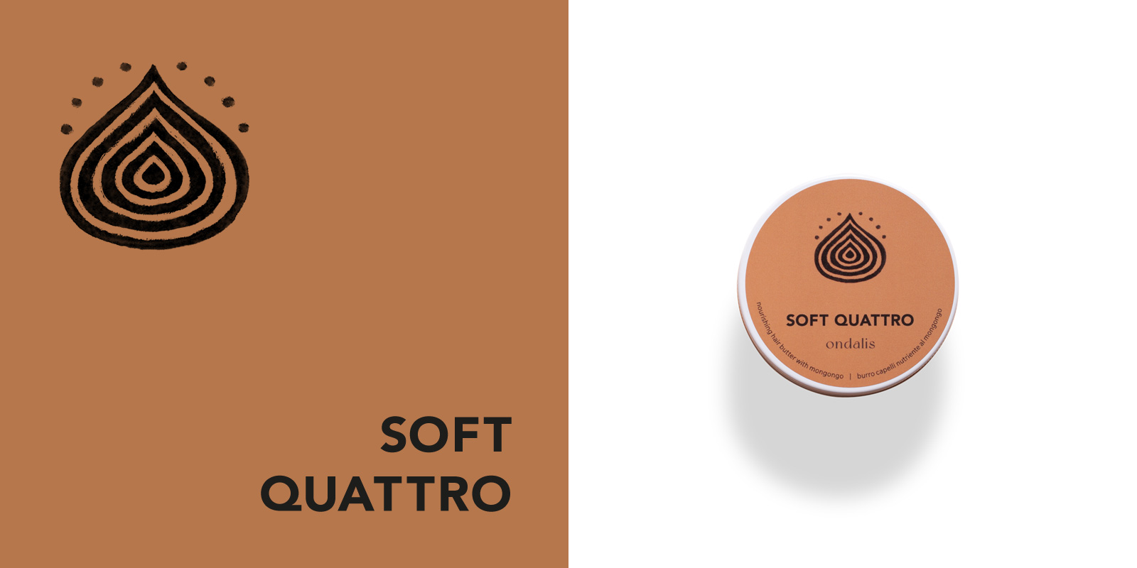
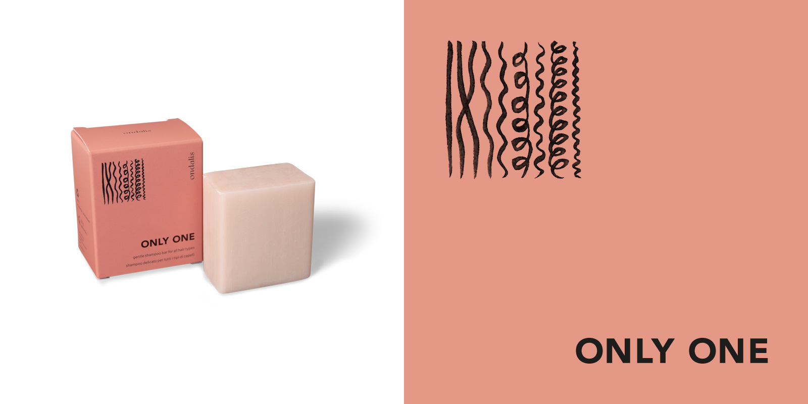
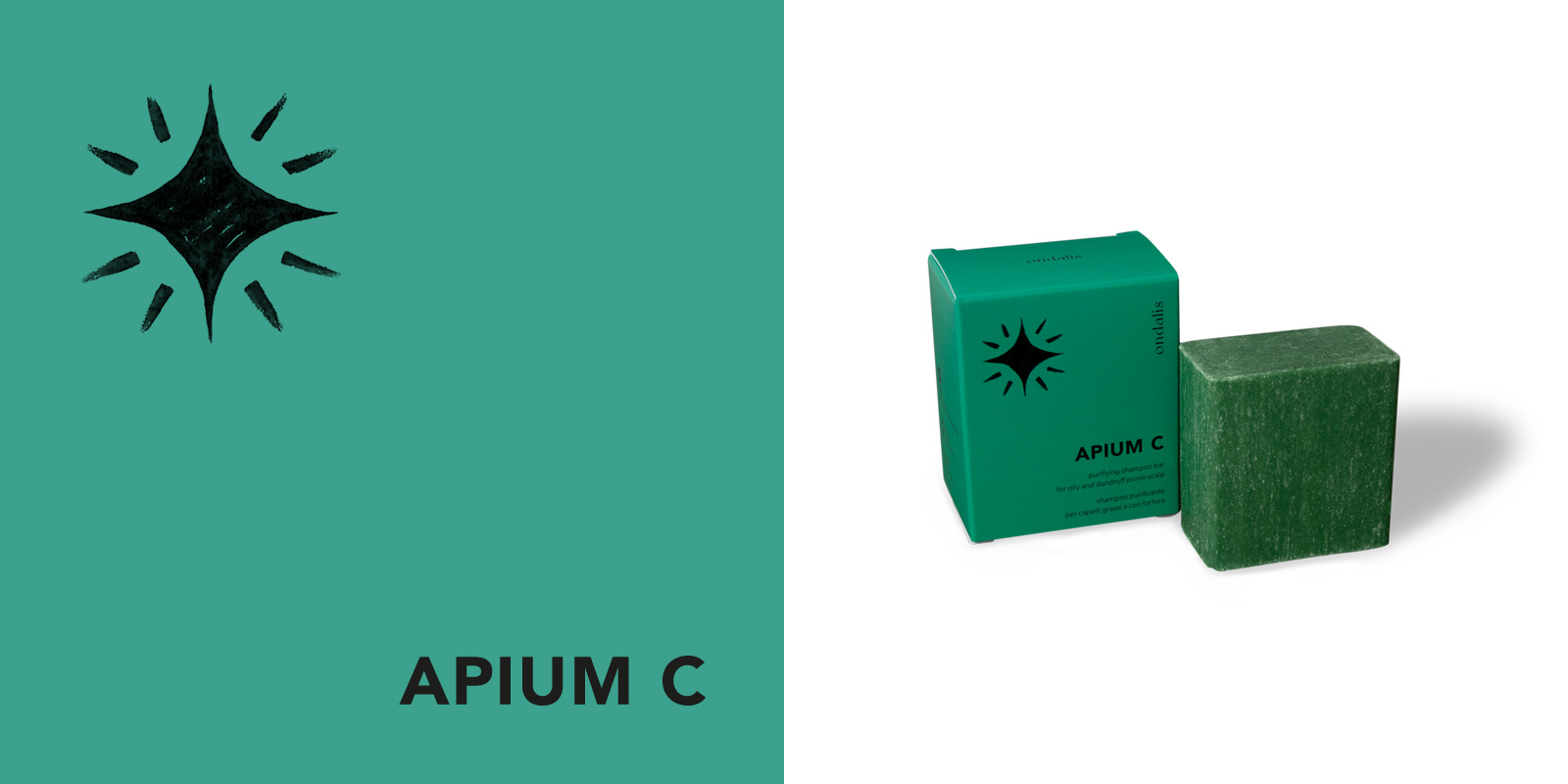
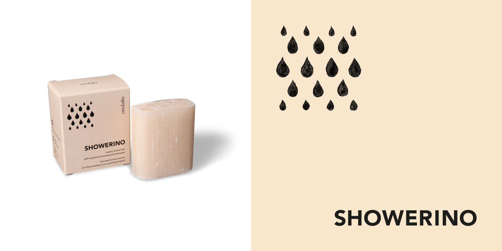
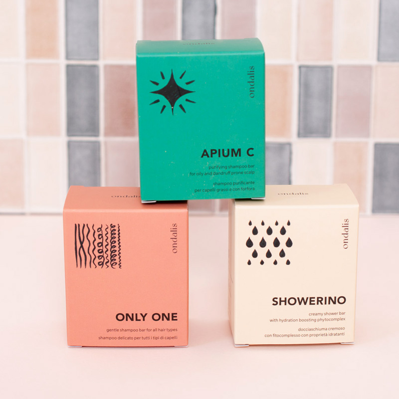
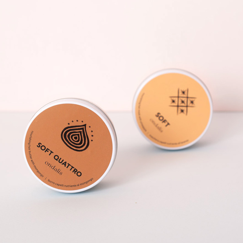
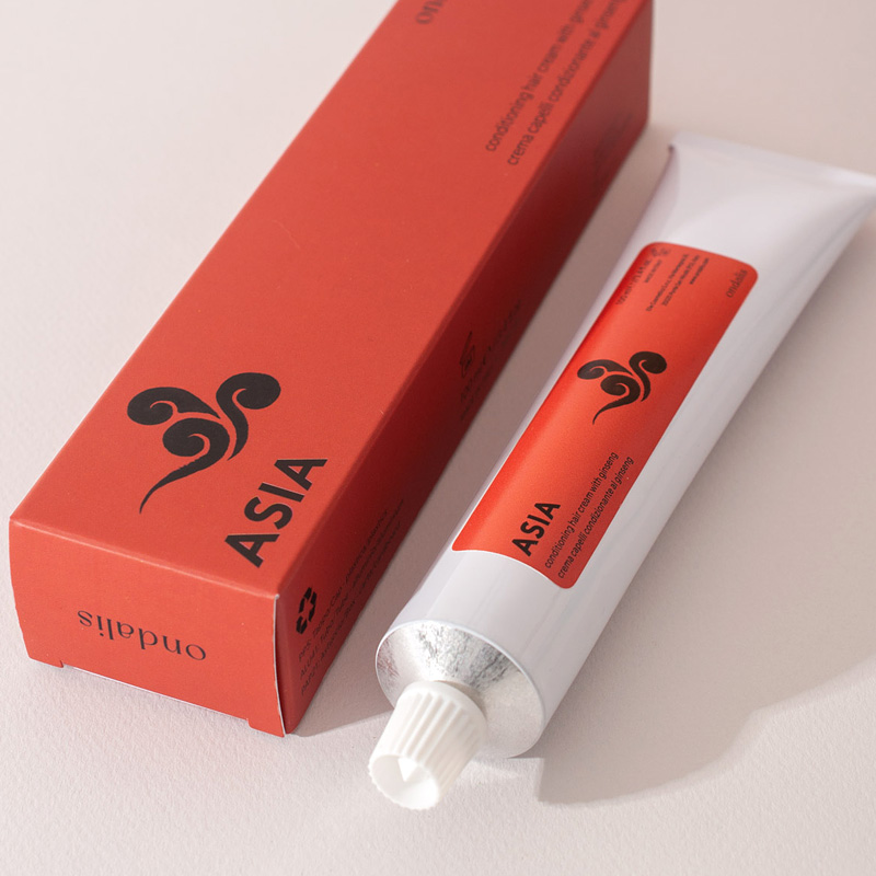
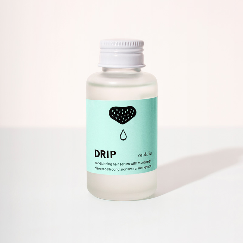
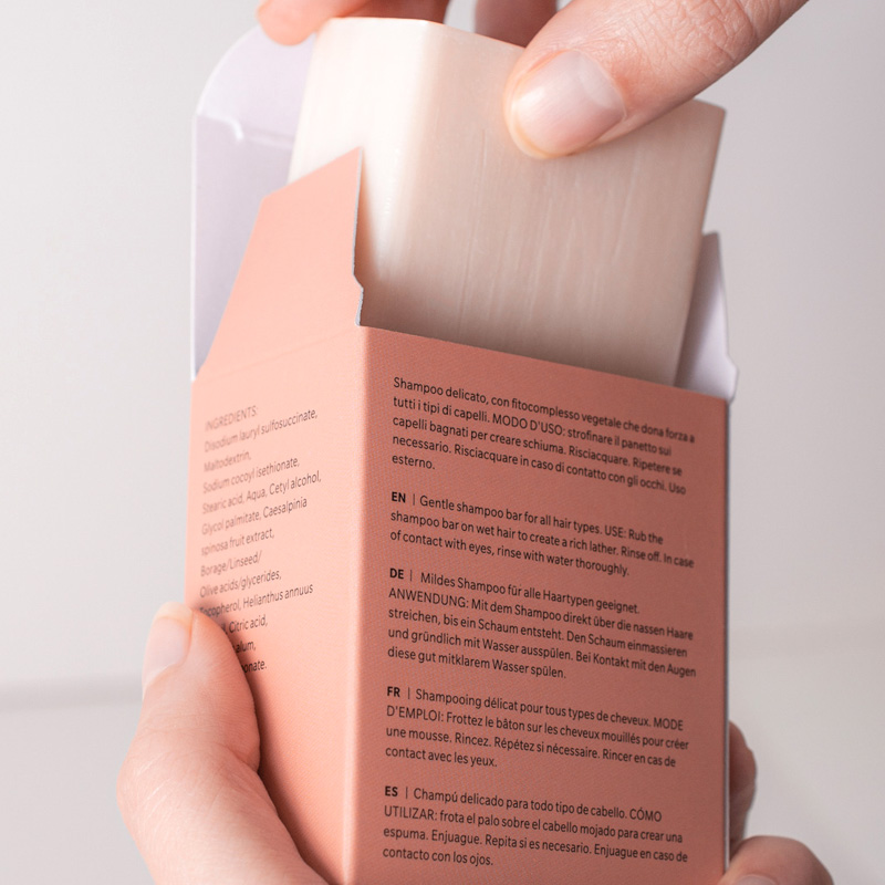
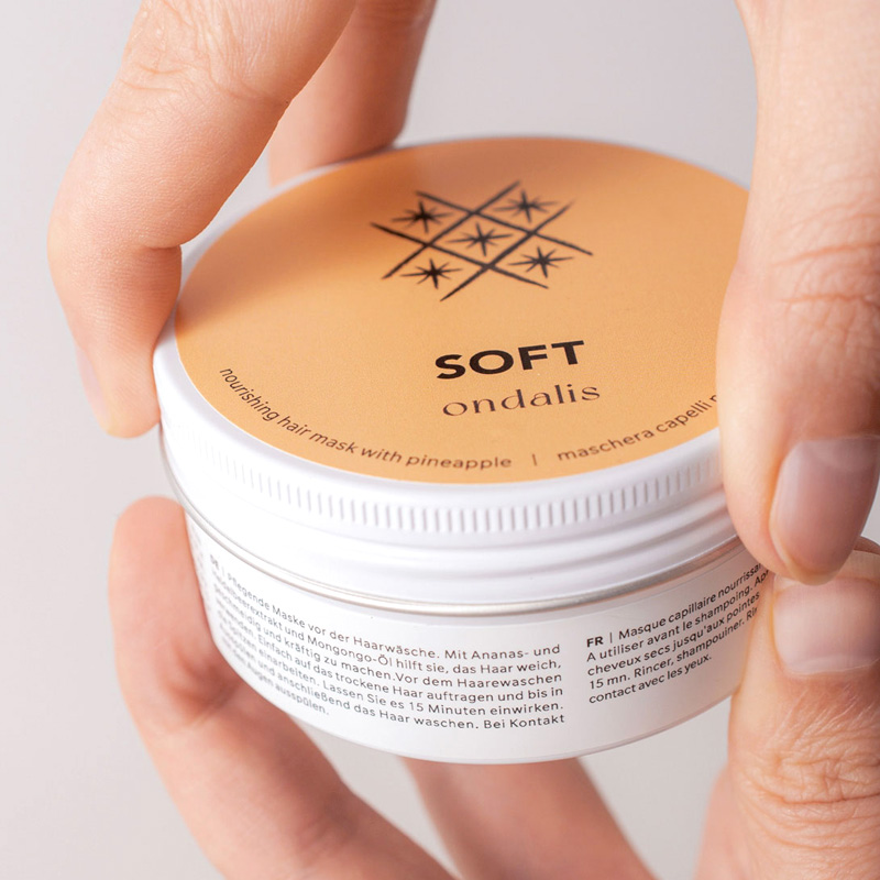
On the front of each product package features a unique and simple illustration that clearly represent the ingredients or functionality. Other elements such as a ingredient list and a usage instruction were organized into a simple layout using a grid layout method.
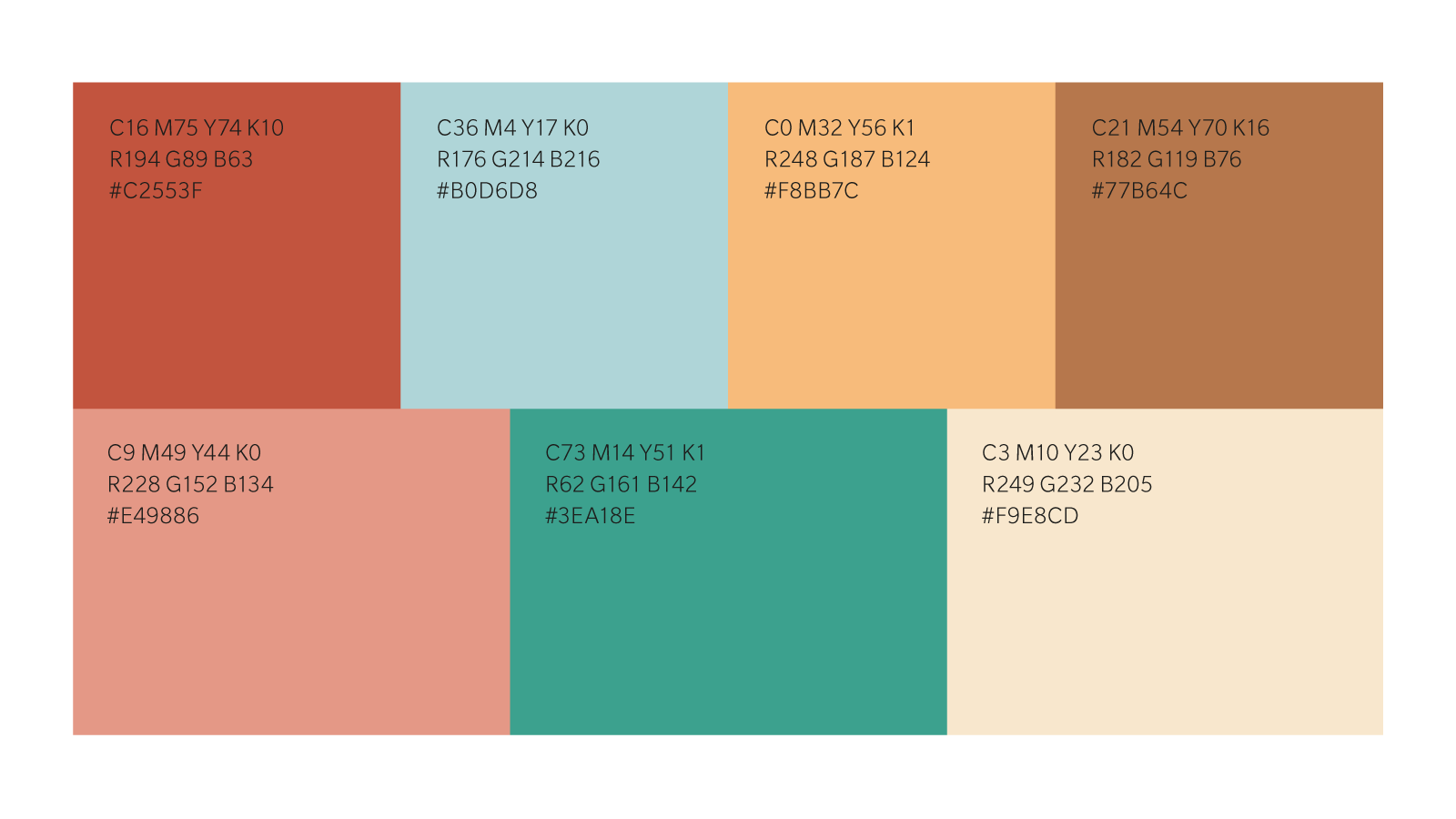
Each product was assigned a key colour from terra-cotta inspired colour palette of 7 colours, which was extracted from the natural colours of beautiful Murano and Burano Islands near Venice, where the birthplace of the brand.
Although I was not fully sure if minimalism design, particularly Japanese minimalism would be recognised and accepted in the competitive cosmetic market, I have had a strong feeling of huge potential for incorporating this Eastern concept into Western brands, especially taking into the fact that minimalism is perfectly rendered eco-friendly business and sustainable culture that has been globally bloomed over a decade.
The result under the new direction turned out exceptionally well and we have received positive feedback from customers who purchased and used the products with new packagings. Those impacts I made through the execution added extra confidence to my design skills.
Recent Portfolios

Lollapalooza 2025

Me and Friends

Floozy Coffee Roasters
